Case Studies
Game Store & Admin Portal
A UI/UX case study in creating game store & admin portal
Timeline: 3 days
Materials: Laptop, Pen, Papers
UX Technique Used:
Competitive/Comparative Analysis, User Personas, Site Maps, User Flow, Wireframing, Prototyping, Usability Testing
UI Technique Used:
Figma, Design trends, clean design, prototyping, auto layout, component, design system.
Brief
For this project, I was provided with a brief to design a new game store website and admin portal for XYZ Entertainment, a large game development studio and publisher that has published 10+ AAA games.
Game store websites are needed by clients so that the games they make can be published on their own platforms so that they can cut other costs that are not needed in terms of game/game item publicity. In addition, the client needs an admin dashboard for game management matters/game items that will be or have been published.
The primary business goals for the XYZ Game Store website included:
- Having clear ways of locating specific products (game/game items)
- Ability to provide a detailed game/game item page
- Having an efficient journey to purchasing one or more products
- Steering costumer towards popular products
The primary business goals for the XYZ Admin Portal Dashboard included:
- Having clear ways to publish products (game/game items)
- Having clear ways to add, edit, and delete products (game/game items)
User Research
User Personas
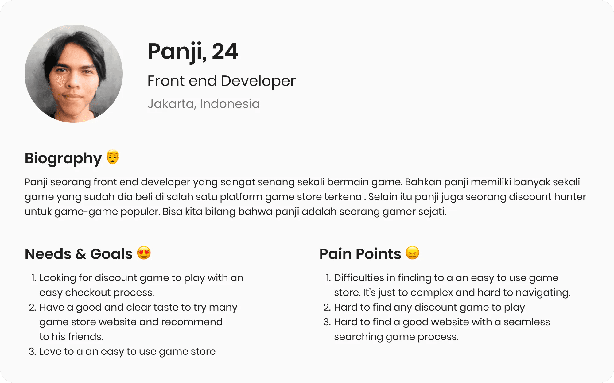
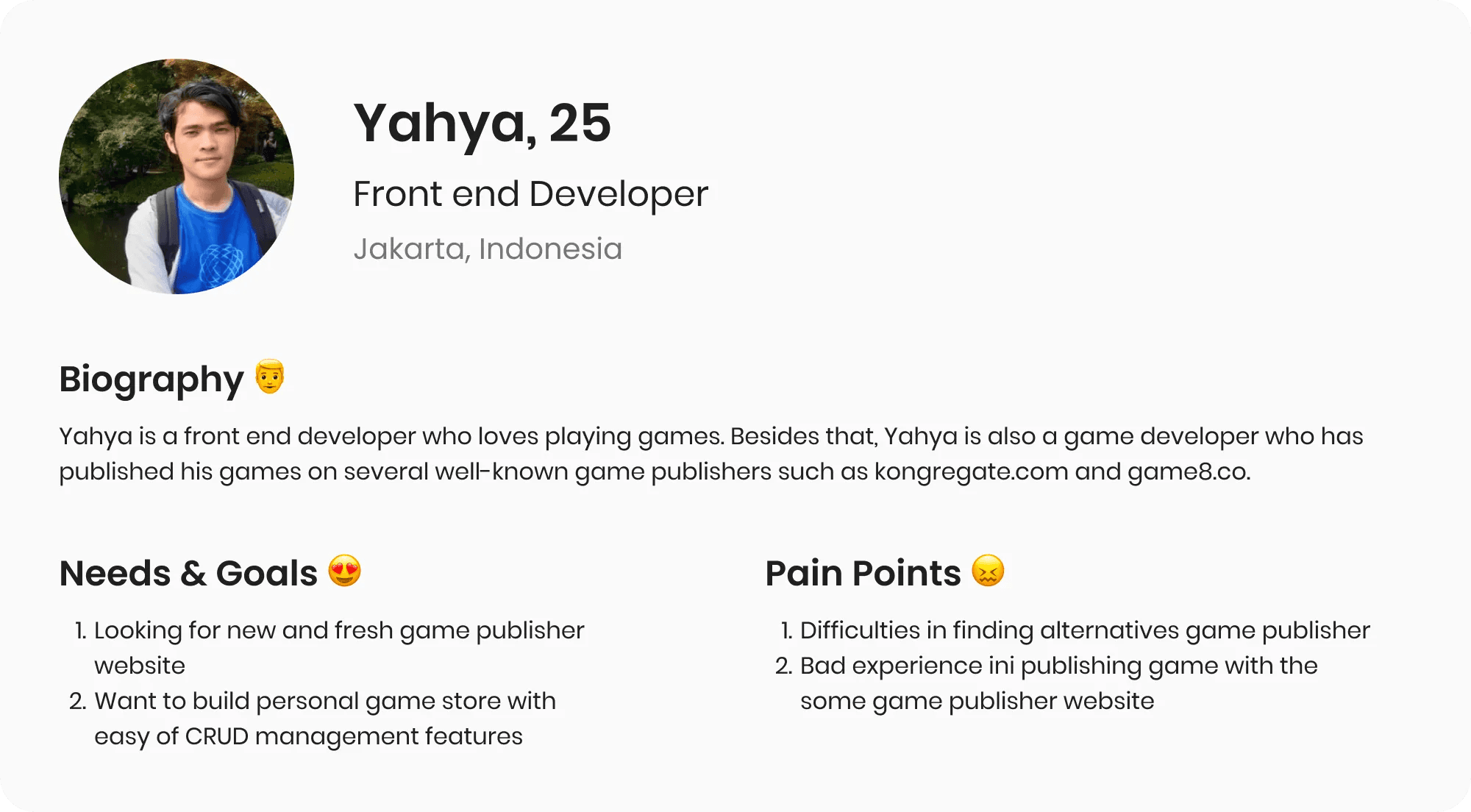
In this case, I defined 2 personas. First, a gamer who is one of the potential users for XYZ Game Store, second the game developer who is experienced in publishing games to gain a more reasonable perspective.
XYZ Game Store user persona
Persona 1
XYZ Admin Portal user persona
Persona 2
The primary needs I defined
For XYZ Game Store:
1. Clear product organization for a seamless shopping experience
2. Product search to easily find products
3. Product suggestions to help in product decision
4. Detailed product information to ensure proper product selection
5. Product reviews to help make informed buying decisions and allow for user input a reviews
6. Efficient checkout process to save the user time and allow for easy purchase of products
For XYZ Admin Portal :
- Easy to add game/game items to publish a new game
- Preview the game before and after publishing to see/review game
- Provide an easy edit feature
- Remove game/game item
Competitor Research/Comparative Research
To gain inspiration for the game store website, I began by identifying 3 main competitors. The direct competitors I analyzed included steam, epic games, and Ubisoft. My goal was to compare and identify common features across these sites and potential opportunities for XYZ entertainment game store.
The most valuable thing I learned from this was how different websites arrange their games and the layout they use. This was useful information that helped guide the next steps.
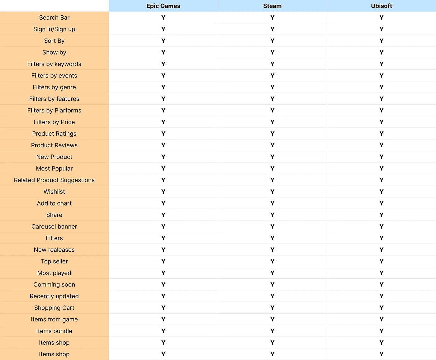
Insight for XYZ Game Store
From the results of several competitor analyses that I have done, I have gained some insights to serve as a reference source in the process of making features for concept tests, which are as follows:
Games are collected into one section based on the category.
Examples of 10 genres that can be implemented for the initial stage are Action, Adventure, Card Game,
Casual, City Builder, Comedy, Exploration, Fighting, First Person, and MOBA.
The search feature is divided into 2, namely the global search feature with the result recommendation/auto-suggestion feature and the other one searches as a keyword that helps filter games on a page.
Several game recommendation sections can be implemented such as Holiday Sale, Top Seller, Most
Played, Top Upcoming Wishlist, New Releases, Coming Soon, Recently uploaded, and others.
Other filters that can be implemented such as game price ranges.
Each game store has a wishlist and cart feature that will make it easier for users to store goods and check out the games they want to buy.
Each game has product ratings
Each game can be shared using the share button.
Insight for XYZ Admin Portal
From the competitor analysis, we have a chance to provide a good visual experience for a publisher to publish their game.
Ideation
How Might We
For XYZ Game Store:
HMW makes it easier for users to explore games based on their categories.
HMW makes it easier for the buyer to get game recommendations based on certain criteria such as games that have been purchased by the user.
HMW makes it easier for users to be able to search for games or game items.
HMW makes it easier for users to be able to filter games based on price ranges.
HMW makes it easier for users to filter based on the game genre.
HMW makes it easier for users to save the games they want to buy later.
HMW makes it easier for users to buy more than one game at a time.
HMW helps users to identify games in more detail with detailed pages.
HMW helps users in determining their decision-making by looking at product ratings.
HMW helps users to be able to share game pages/game item details with others.
HMW makes the checkout process of game/game items seamless.
HMW for XYZ Admin Portal:
HMW make it easy for the publisher to publish their product seamlessly.
HMW make it easy for the publisher to edit their product.
HMW make it easy for the publisher to preview their product before and after publishing.
HMW make it easy for the publisher to remote their product from the list.
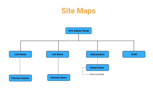
Site Maps
I developed a site map to specify the overall layout of the website and turn it into ideas from other competitor websites. In order to improve the user experience and make sure that items were located where customers would expect to find them while visiting the website, this was done.
Site maps for XYZ Game Store:

Site Maps for XYZ Admin Portal:
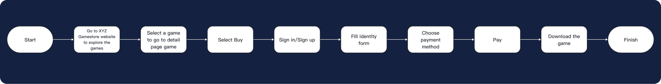
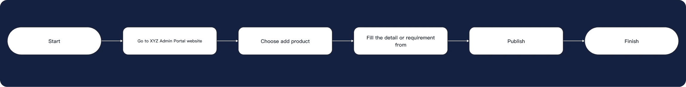
User Flow
User flow purchasing a game from XYZ Game Store :
Based on the HMW results above, it is obtained that the main flow for users when users use this website is the flow for purchasing products. The following is the main flow for non-login users when they want to buy a product.
User flow publishing a game on XYZ Admin Portal:
The HMW XYZ Admin Portal includes a user flow that outlines the steps for users to publish their own games. This process is demonstrated in the flow provided below.
Development Phase
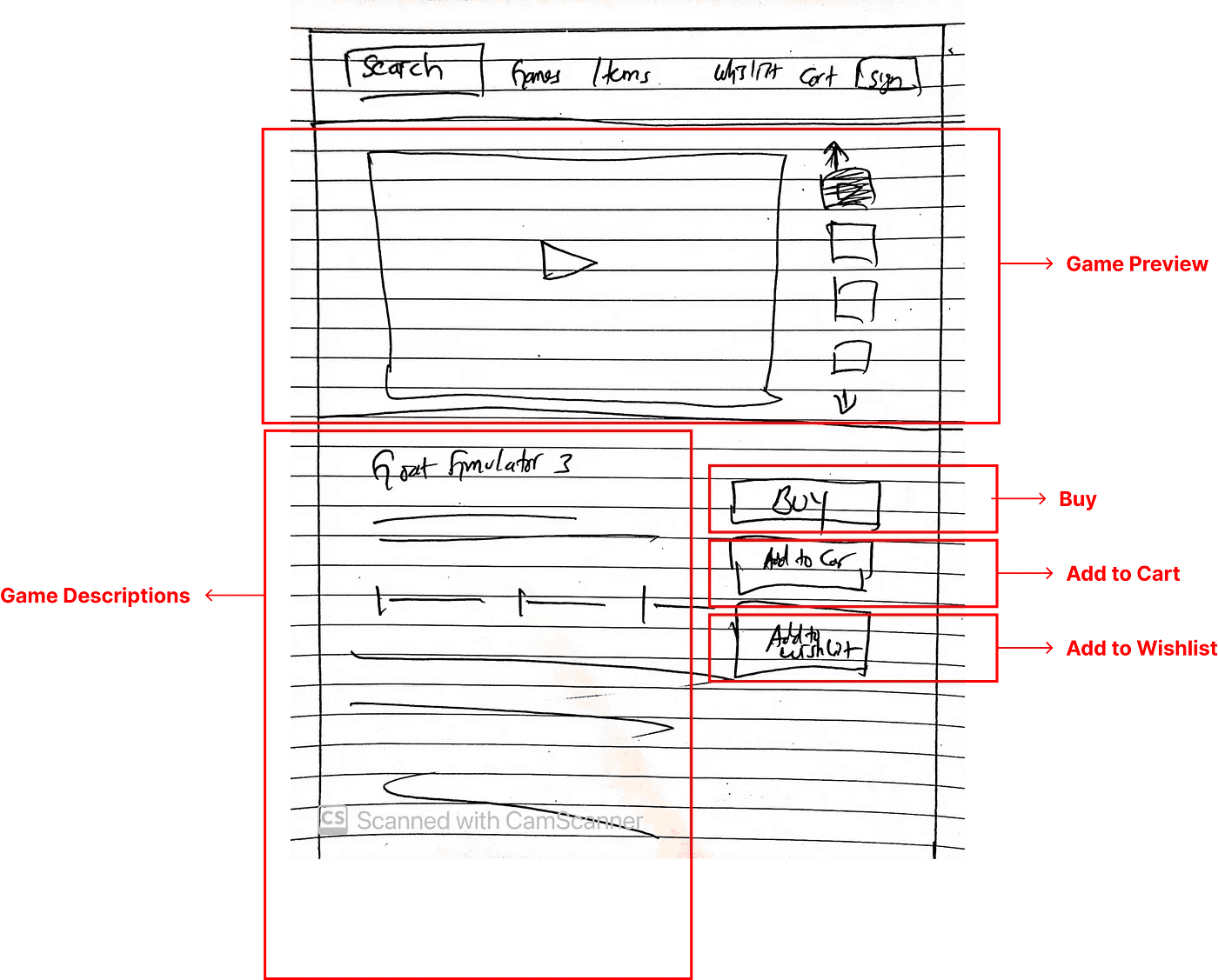
Sketching
I reorganized my insights from the exploration phase and then started designing the website. To begin, I drew several sketches of the main pages, using the user flows as a reference. This helped me quickly come up with ideas for the website layout. I then tested these ideas with two participants to see if they met both the user and business requirements.
XYZ Game Store Sketch

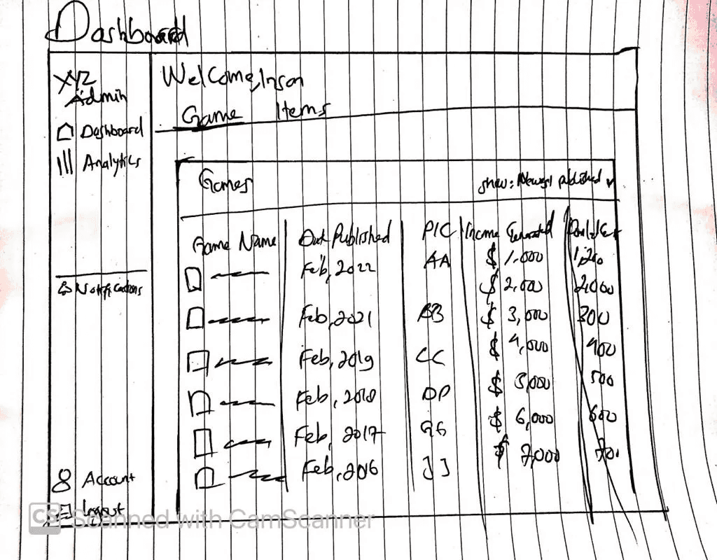
XYZ Admin Portal Sketch
Wireframing
Using Figma, I began to design my first wireframes based on the feedback and insights I gained from the sketching phase. I prioritized features that would most effectively meet the needs of the users throughout the website.
XYZ Game Store Wireframe:
XYZ Admin Portal Wireframe:
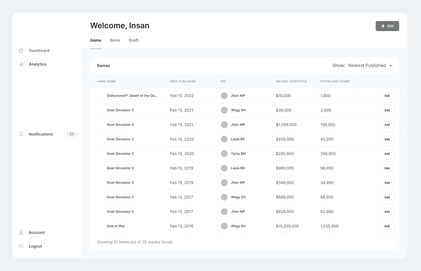
Dashboard
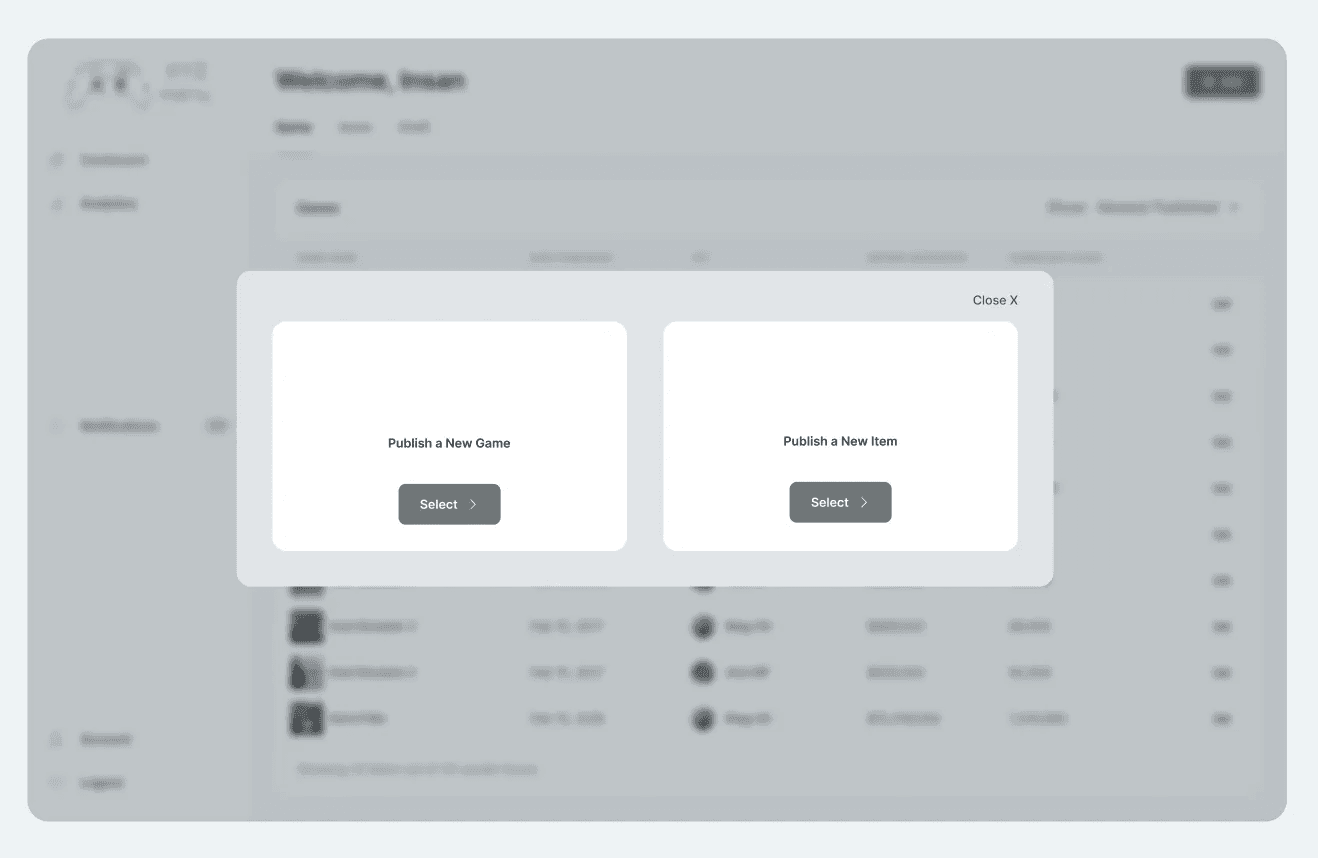
2. Select product to publish screen
3. Fill form before publish a game screen
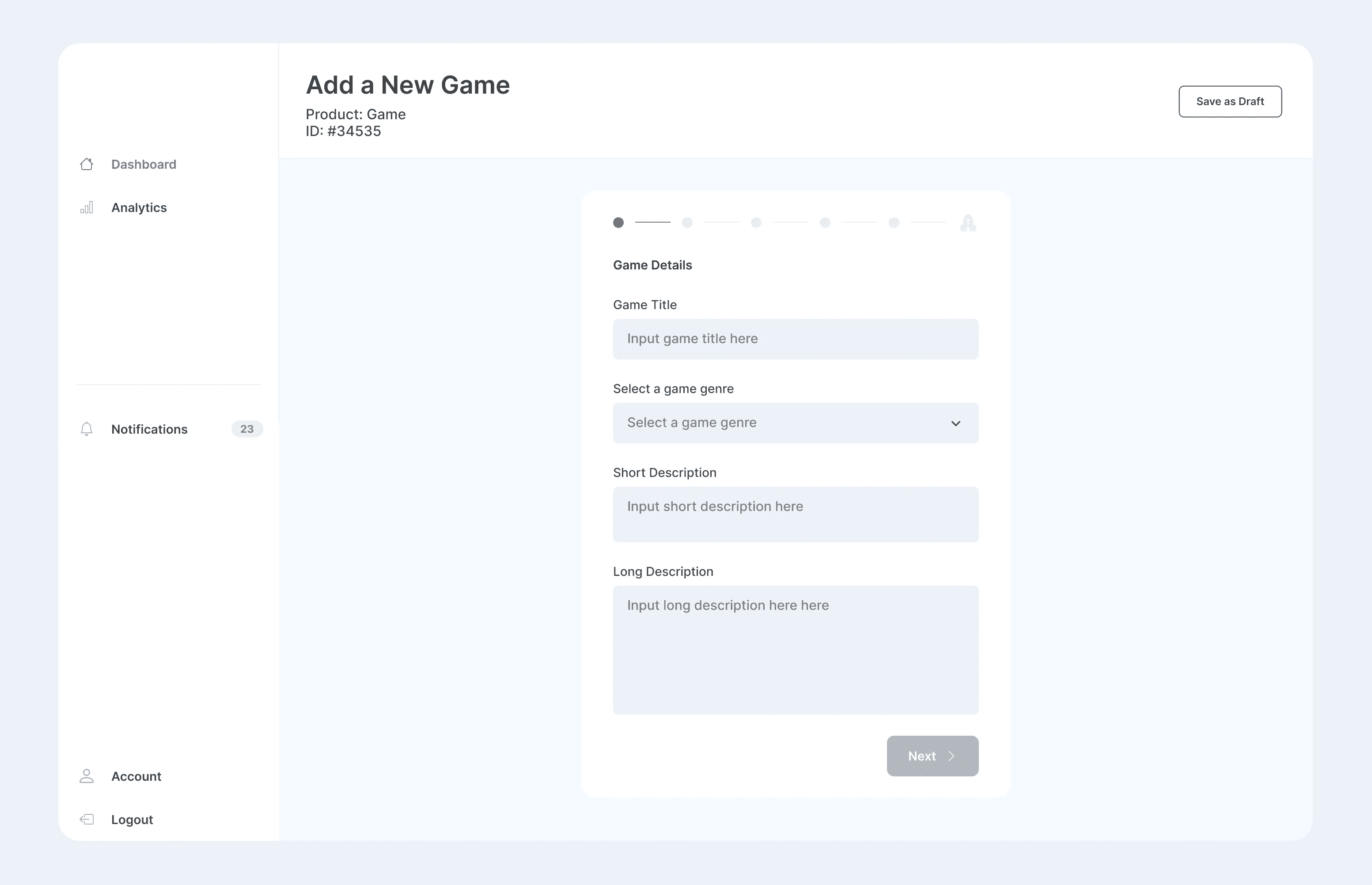
4. Preview game screen
Prototyping
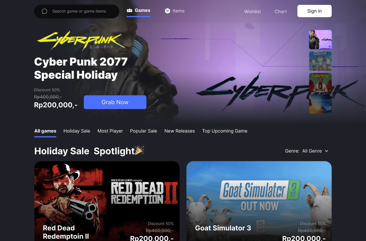
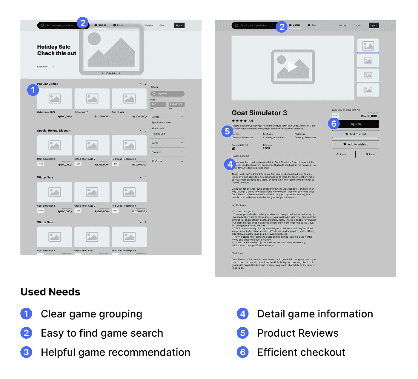
1. Game Explore Page
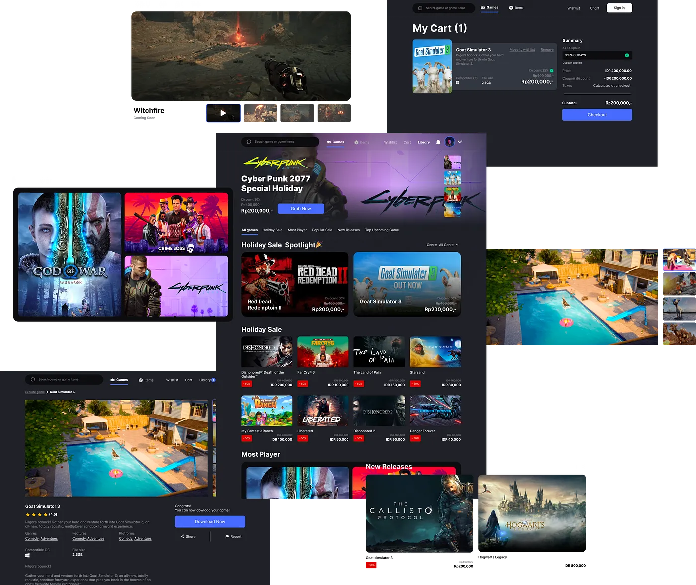
I kept the homepage simple to avoid overwhelming users when they first visit the site. To help users easily find products, I included global and secondary navigation, as well as a search bar. The carousel event is one of the most important sections to engage users and can increase user retention and also increase user engagement.

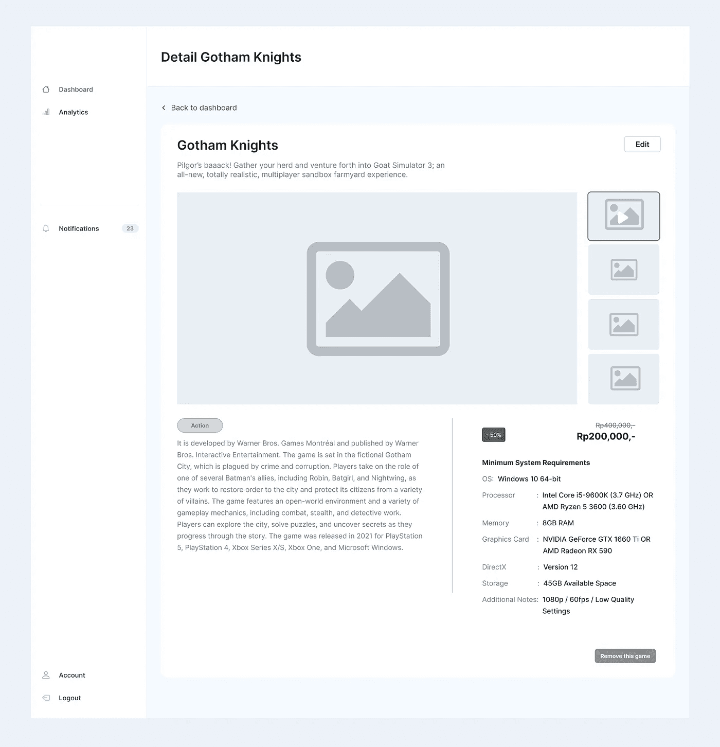
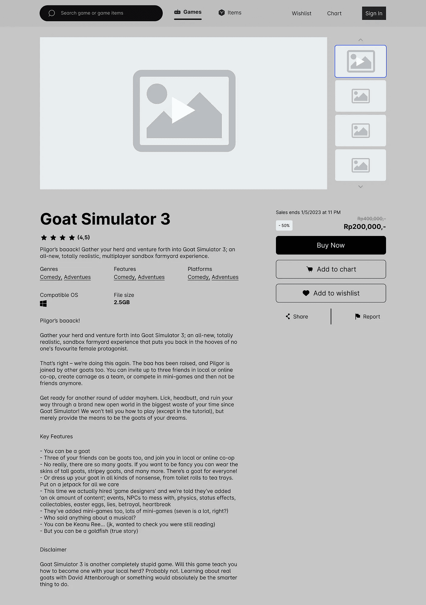
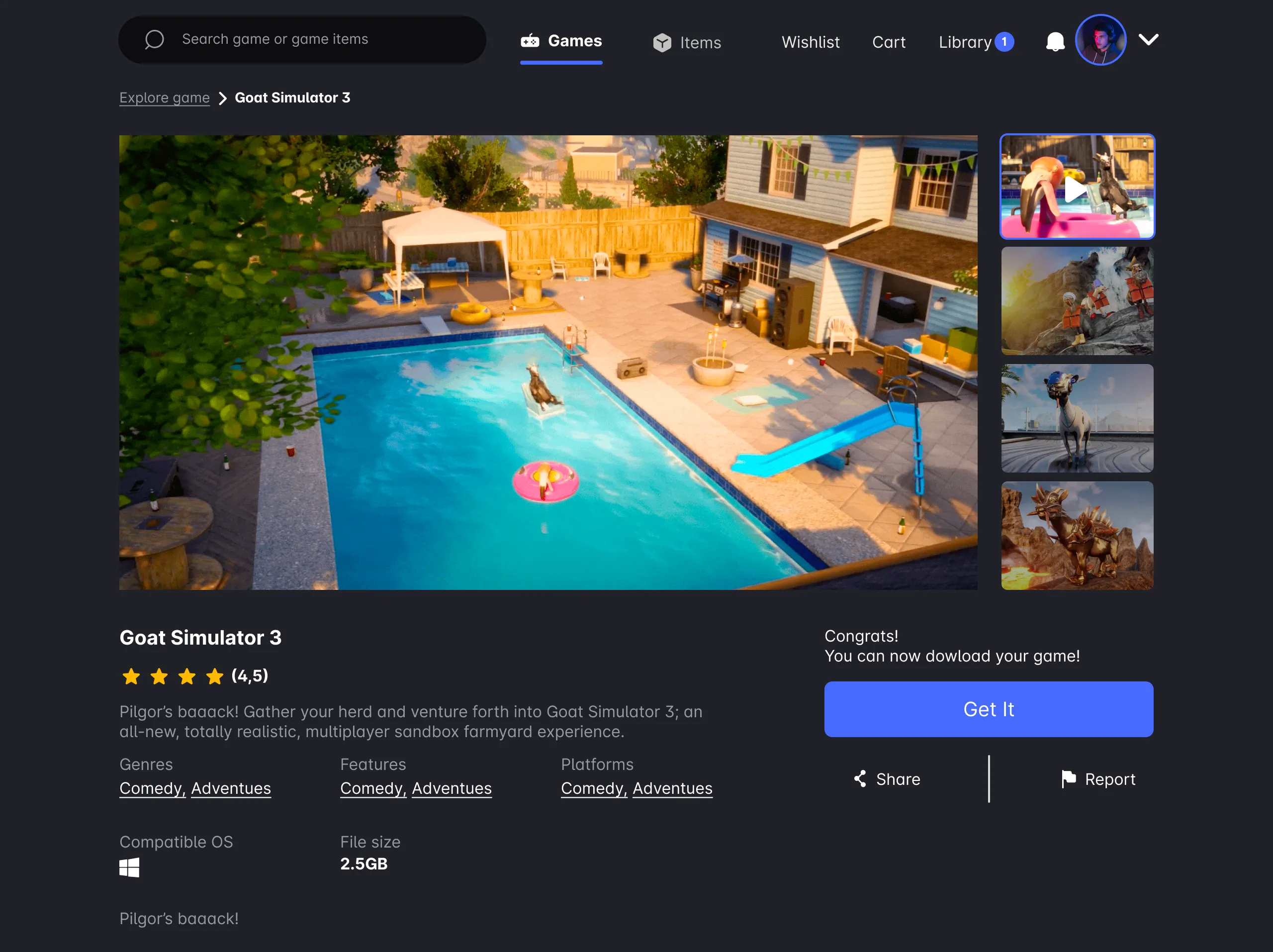
2. Game Detail Page
On a game detail page, I like to provide a detailed game description so that users can make sure the game meets their expectations. To make the checkout process as efficient as possible, I provide three options: “Buy,” which allows users to directly purchase the game by first creating an account and then making a payment; “Add to cart,” which allows users to add the game to their cart to purchase later; and “Add to wishlist,” which allows users to save the game for later without committing to a purchase.
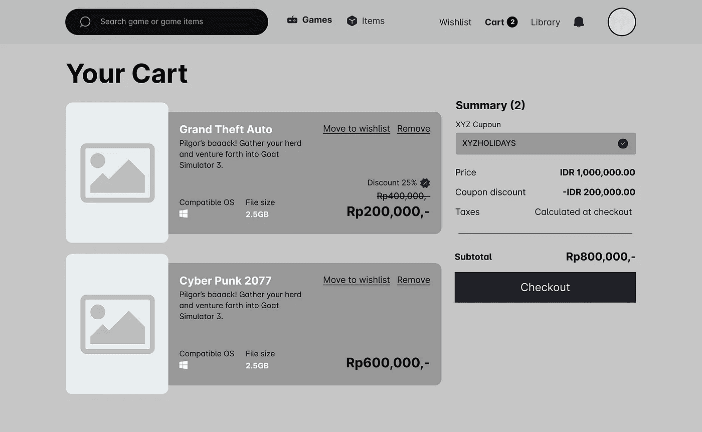
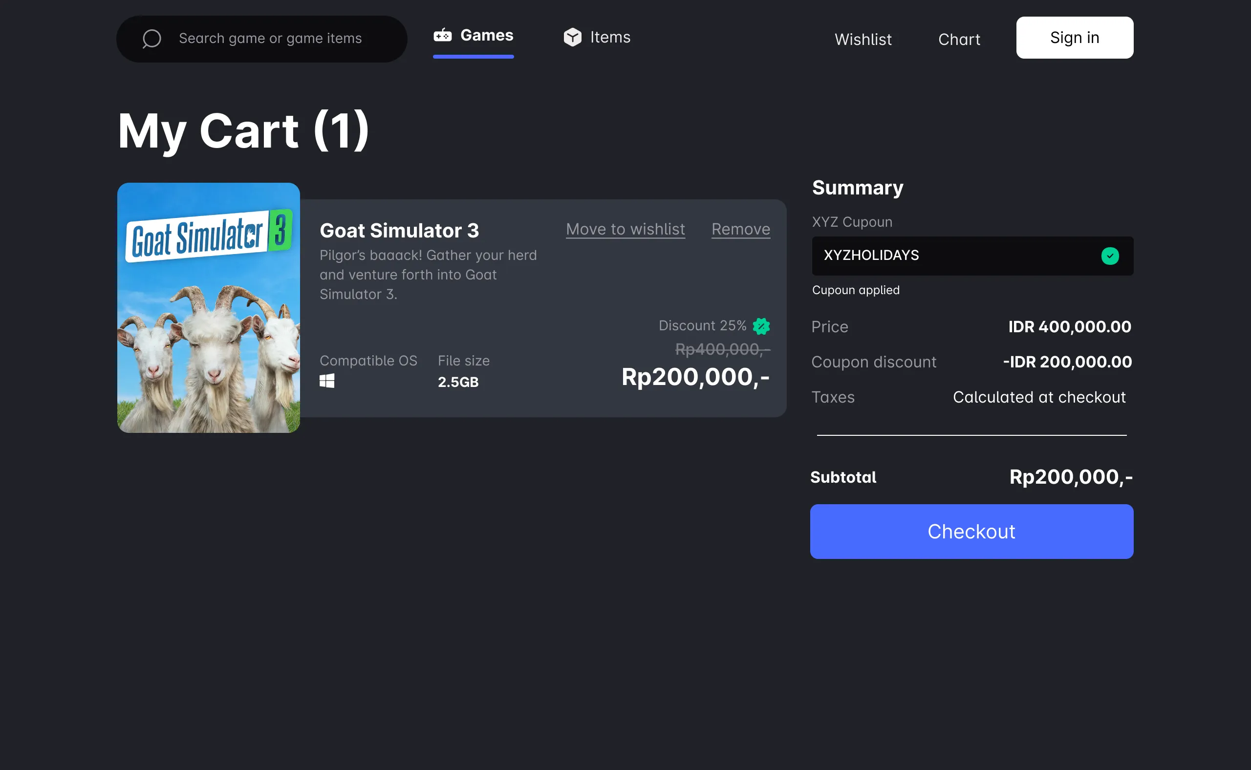
3. Checkout Flows Page
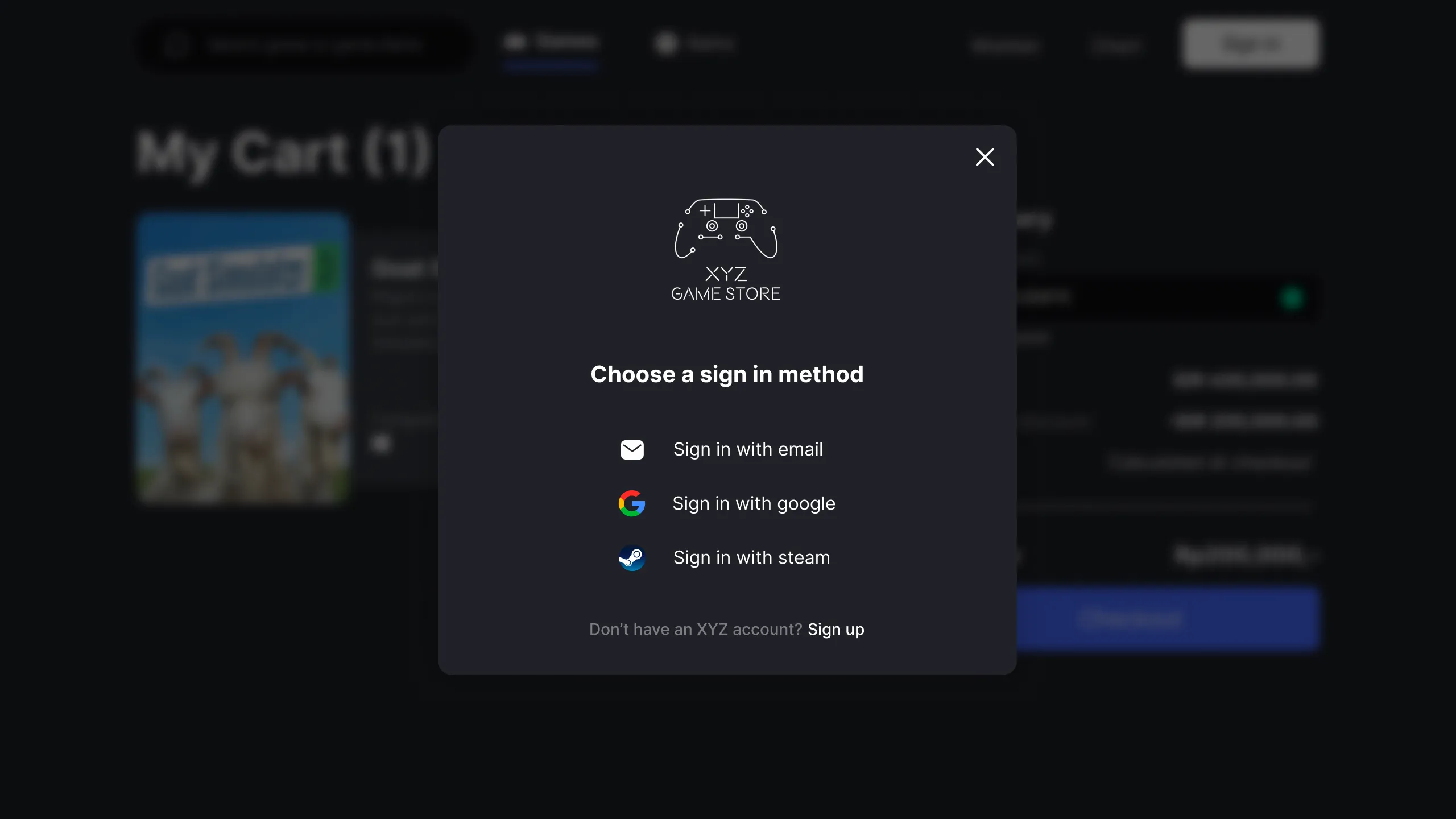
On the cart page, users can see all the games they want to purchase. When the user clicks the checkout button, those who are not logged in will be redirected to log in, while those who are logged in will be taken to a page to select a payment method.
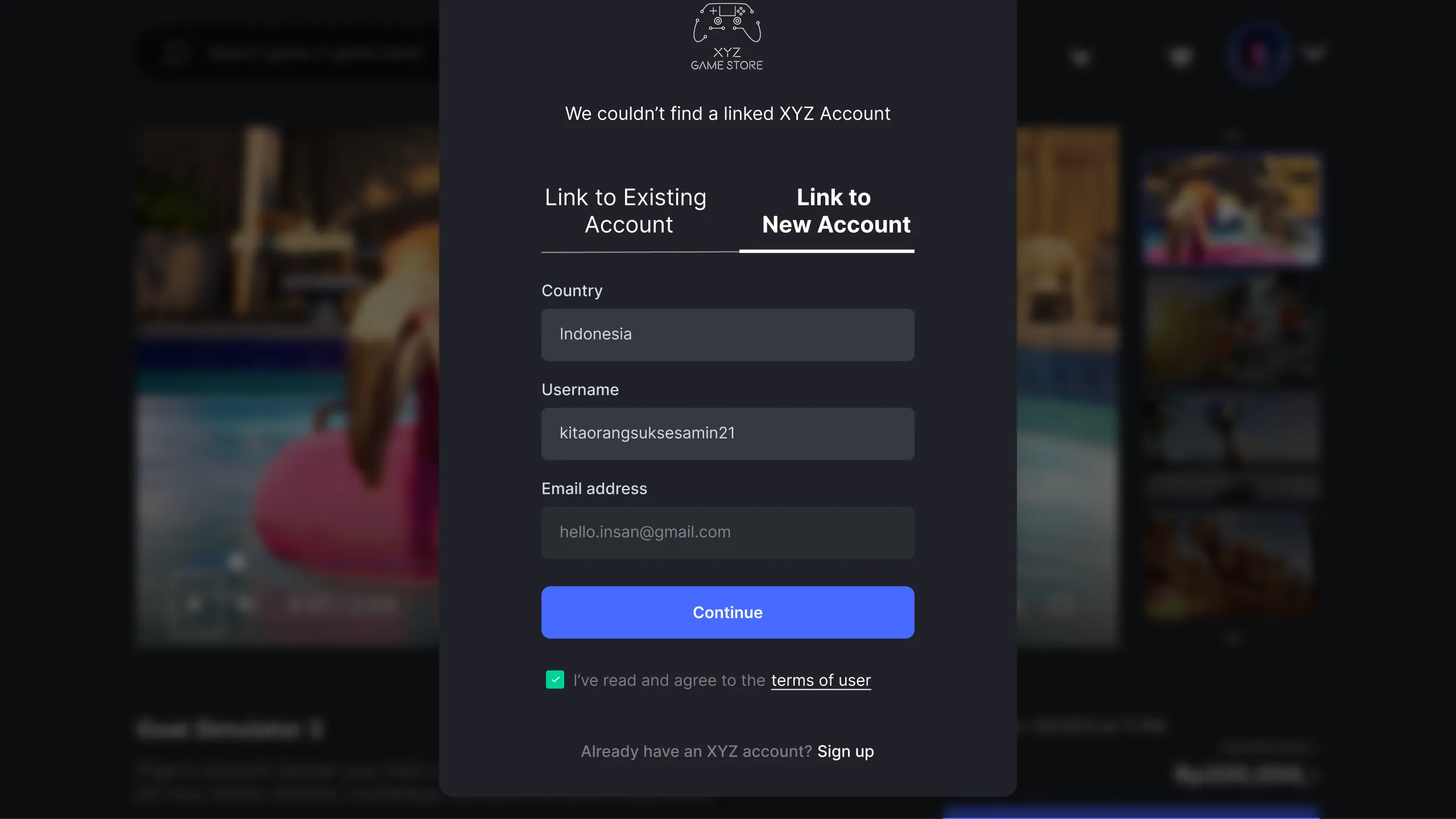
If a user tries to check out without being logged in, the system will redirect them to sign in. If the user selects the option to sign in with Google, the system will check if their account is registered in the database. If it is not, the user will be directed to complete a registration form.
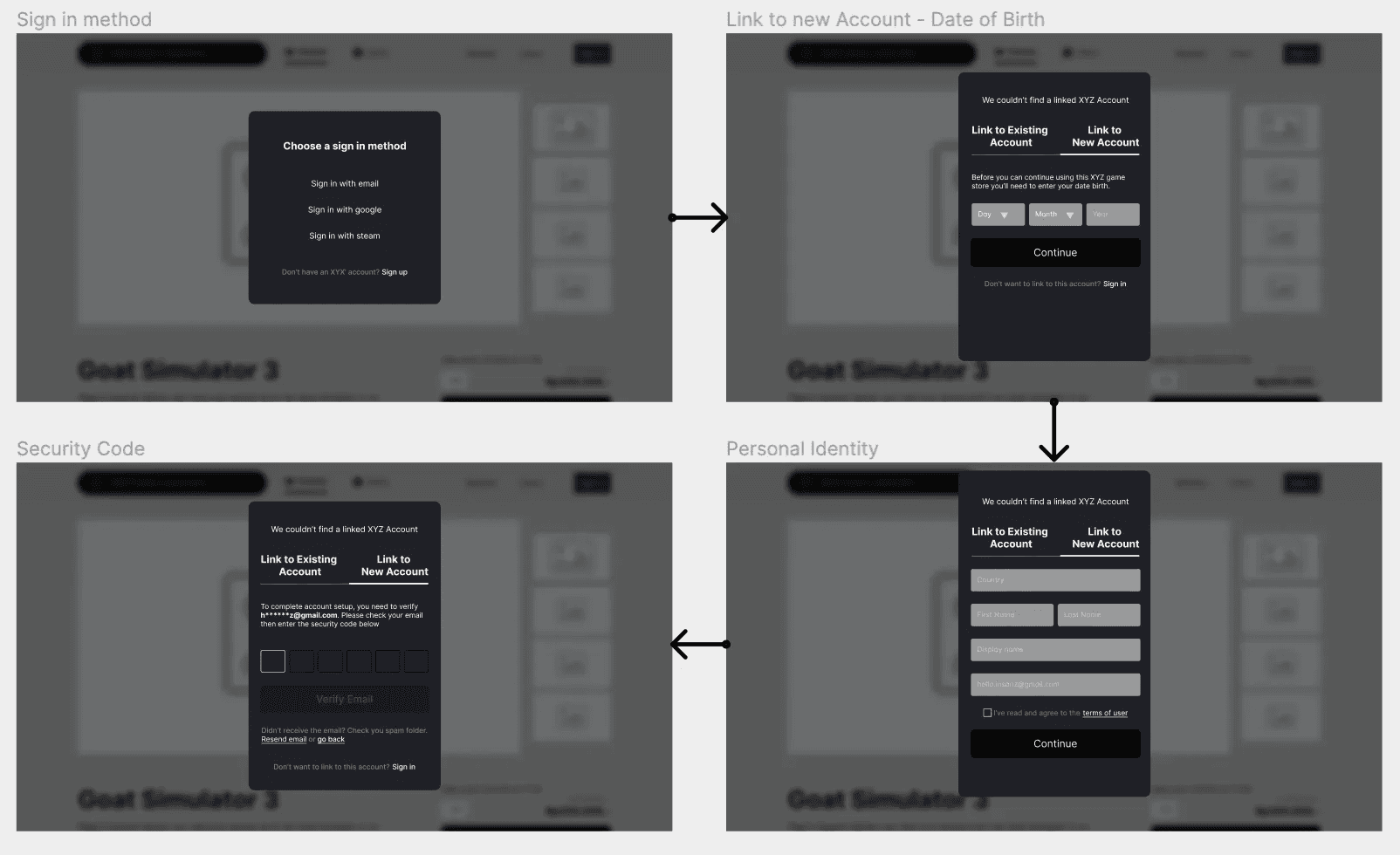
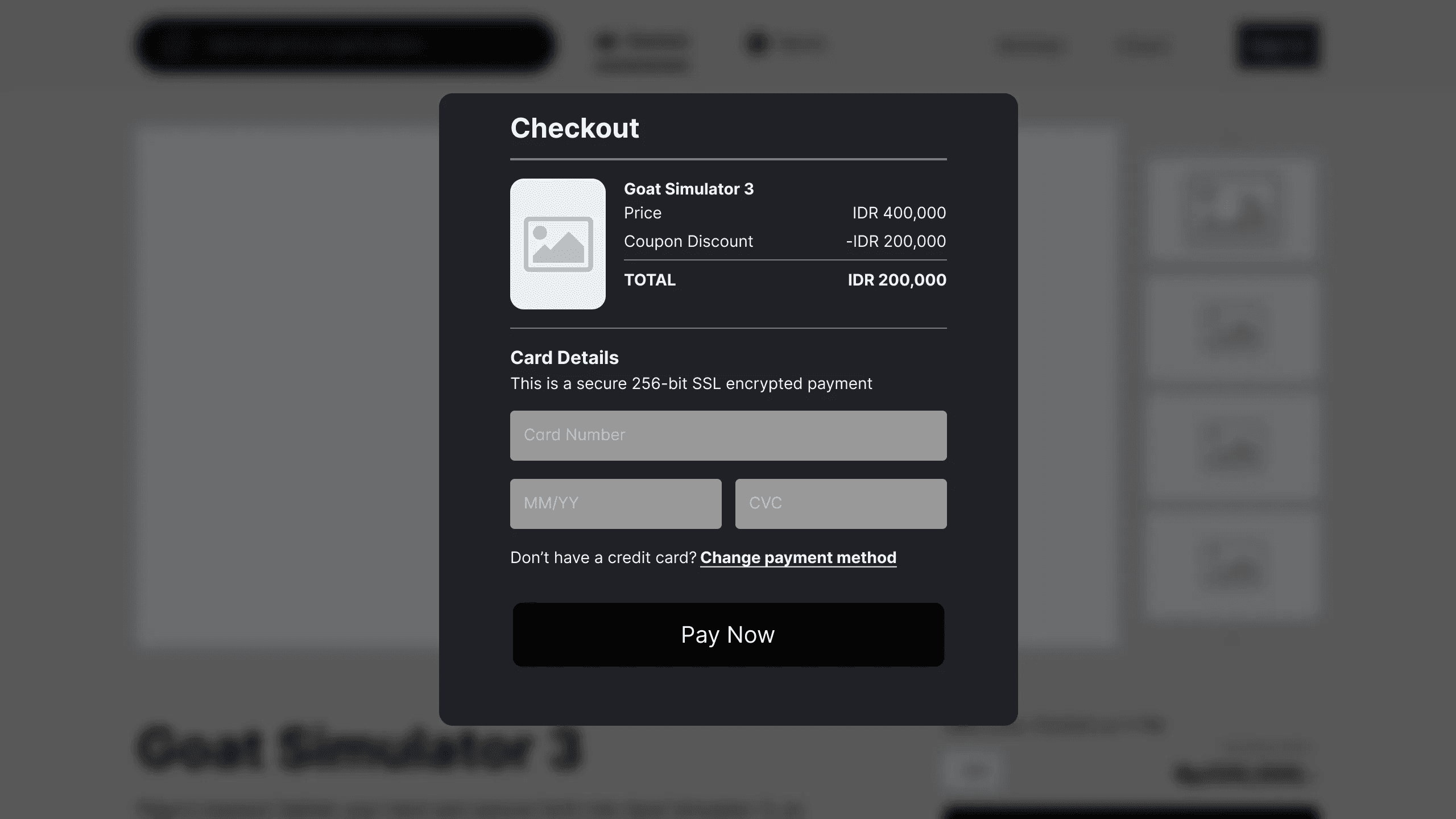
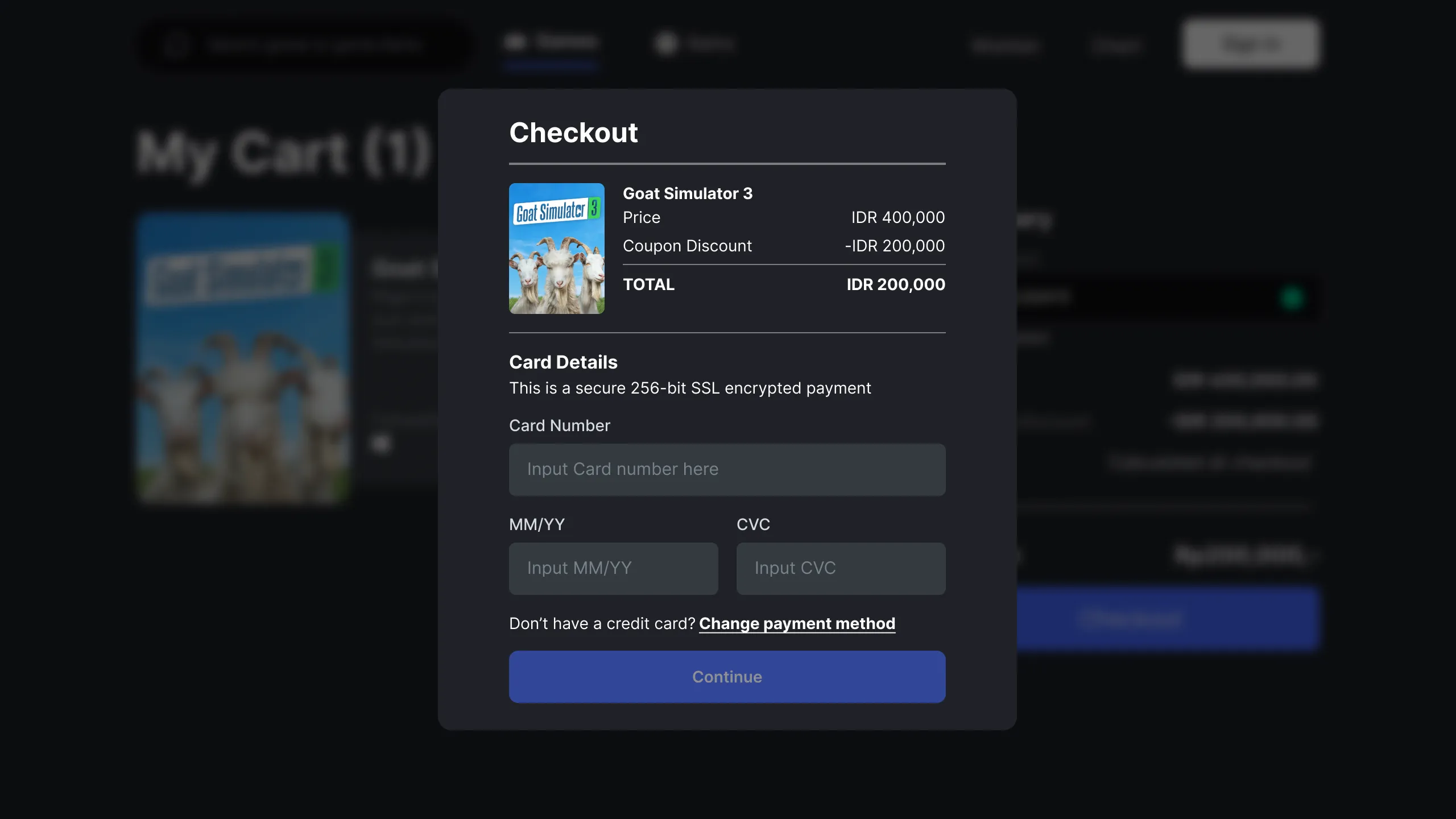
After a user successfully registers, they are taken to the checkout page to complete their purchase. On this page, they can see the games they have selected and any discounts they are eligible for. The user is then prompted to pay with a credit card. If they do not have a credit card, an option to choose an alternative payment method is provided.
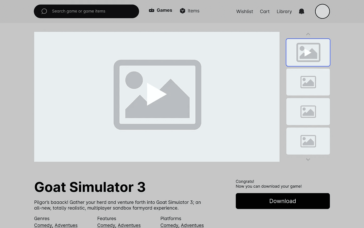
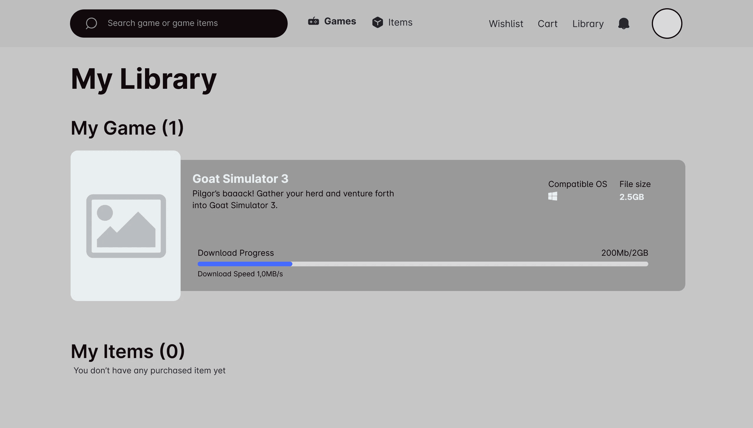
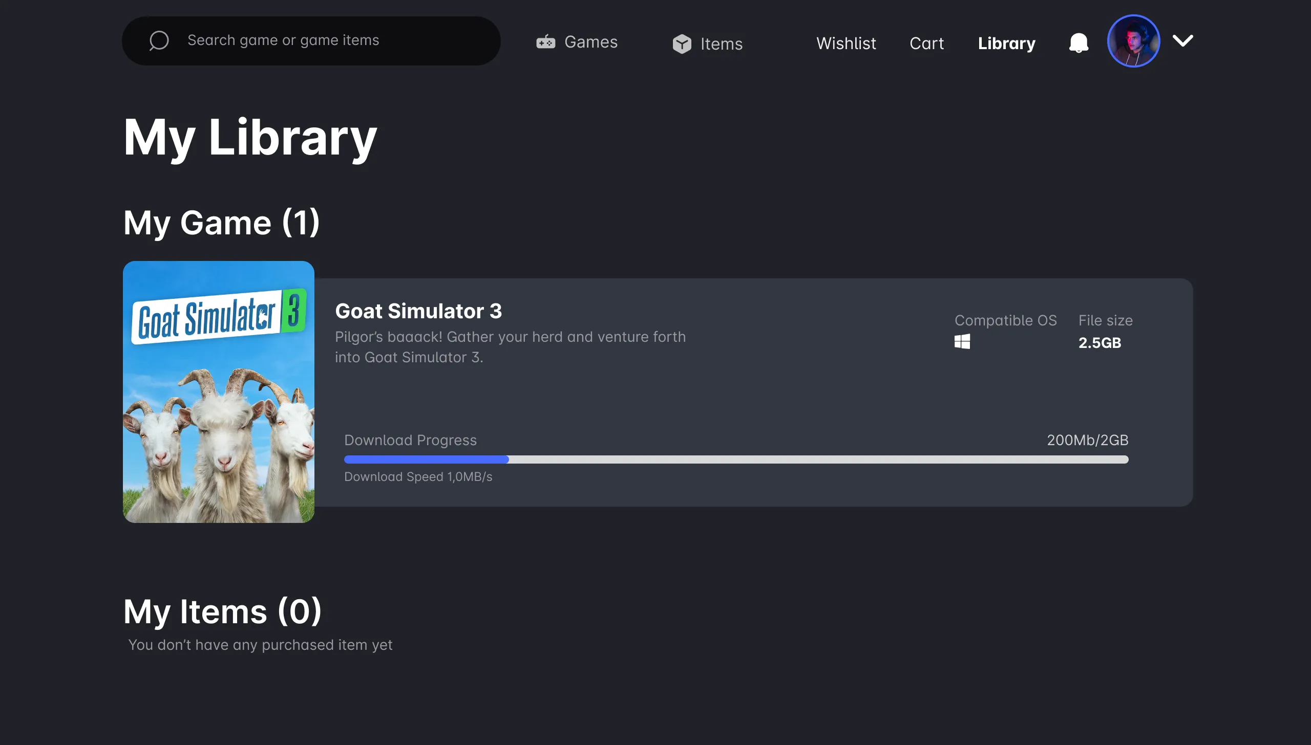
Once the payment has been processed successfully, the user can access a download button to obtain the game. If the user clicks the “download now” button, they will be taken to the library page where they can track the progress of the download.
My library is a place where user can see their purchased product and also see the download progress.
Concept Testing
After finishing my wireframes, I made a prototype of my website to see how people would use it and if it met their needs. It was important to test with mid-fidelity, black-and-white wireframes so I could get honest feedback from potential users and make sure the website worked properly before focusing on its appearance.
I did a concept test with 2 people and had them go through 3 different scenarios to imagine they were my user personas. These 3 scenarios included:
1. You want to play the latest game. Try to show me how you find/select games and buy them successfully.
2. Show me how you save the product and then buy all the product.
3. Show me how you buy one of the items.
These were my key findings from the concept tests for XYZ Game Store:
Users prefer game sections that are stacked or displayed many at once rather than having to see one by one in a carousel via the chevron button.
Users are more interested in video clips than static images when the game card is hovered over by the cursor.
When the product game that is on the wishlist is already in the cart, you should use “in cart” for the title.
It is very important that there is a recommendation section that contains a collection of game recommendations that have a similar category to those that have been purchased by the user.
Reviews or ratings from trusted websites or users who write reviews with playtime data displayed have more than 80% influence on helping the user’s decision when they want to buy a game.
Checkout flow is already good and effective enough for the user.
The filter on the right is too overwhelming, it’s best to keep it as minimal as possible.
Change the download button on the game detail page to “Get It” / “Get Now”. Because the words “Download” can be misunderstood because users don’t download games on their devices.
These were my key findings from the concept tests for XYZ Admin Portal:
Facilitate the publishing process which is currently still a bit complicated.
Make the product publish form as attractive as possible so that publishers are enthusiastic about uploading products.
Iterating Feedback and Visual Design/High-Fidelity Phase
In this stage, we will carry out a design iteration of the feedback or input that we have previously received at the concept testing stage as well as enter the stage of making high-fidelity.
1. Mood board
During the mood board stage, we will collect design inspiration to help us decide on a suitable design style for a game store website. We will gather inspiration from major game publishers such as Epic Games, Steam, and Ubisoft, as well as from sources like Dribbble and Behance.
2. Color Paletes
After examining several mood boards, we have determined the colors that will be featured prominently in our design, as shown below.

3. Time to use my super power (Design the UI)
Now that we have chosen our colors, it’s time to bring this gray world to life with the vibrant hues we selected earlier.
UI Design XYZ Game Store
2. Game Detail Page
3. Cart Page
4. Sign In Page
5. Register Form
6. Checkout
7. “Buy Now” change to “Get It” Button
8. Library Page
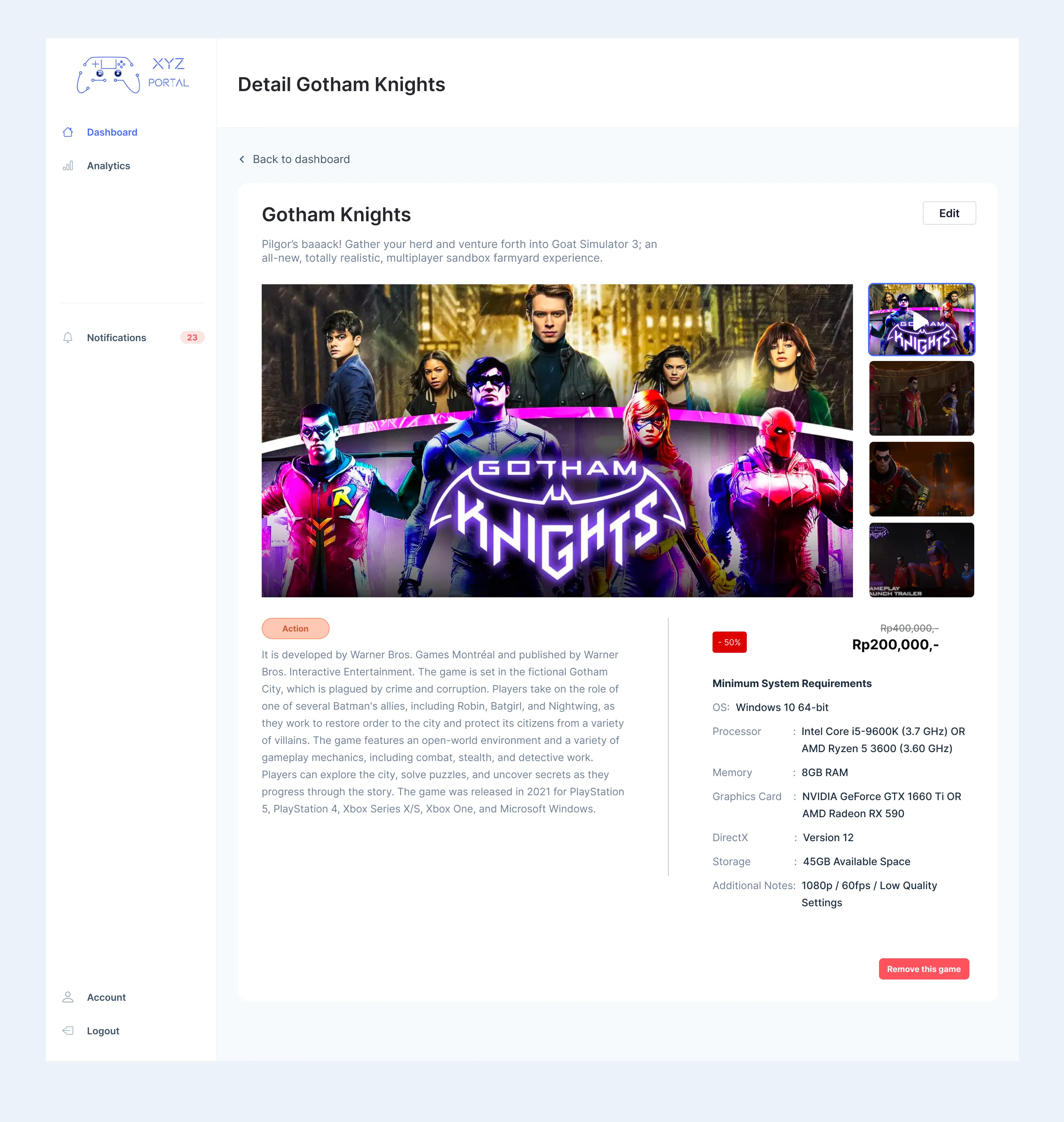
UI Design XYZ Admin Portal
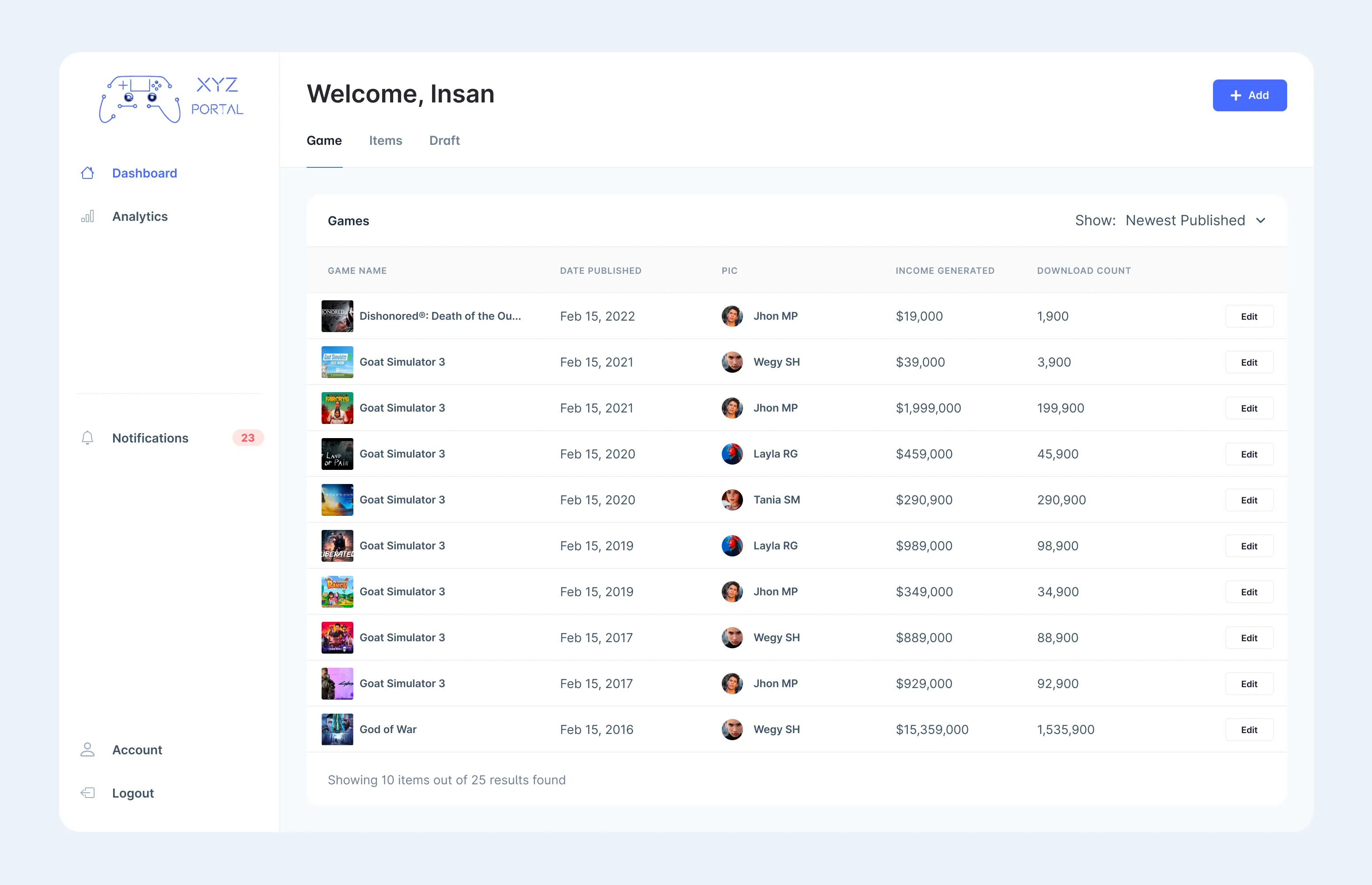
1. Admin Dashboard
2. Choose a Product to Publish
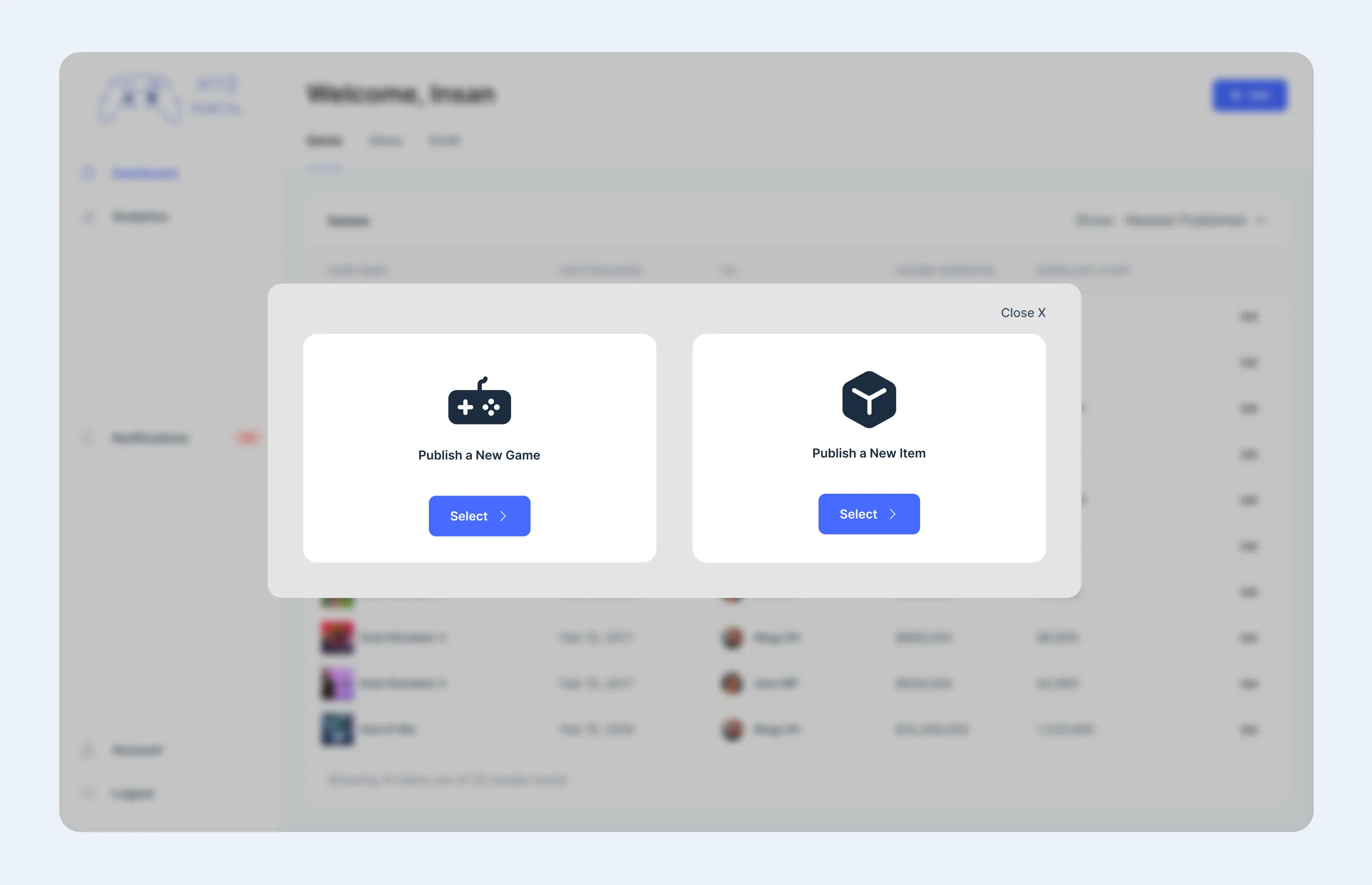
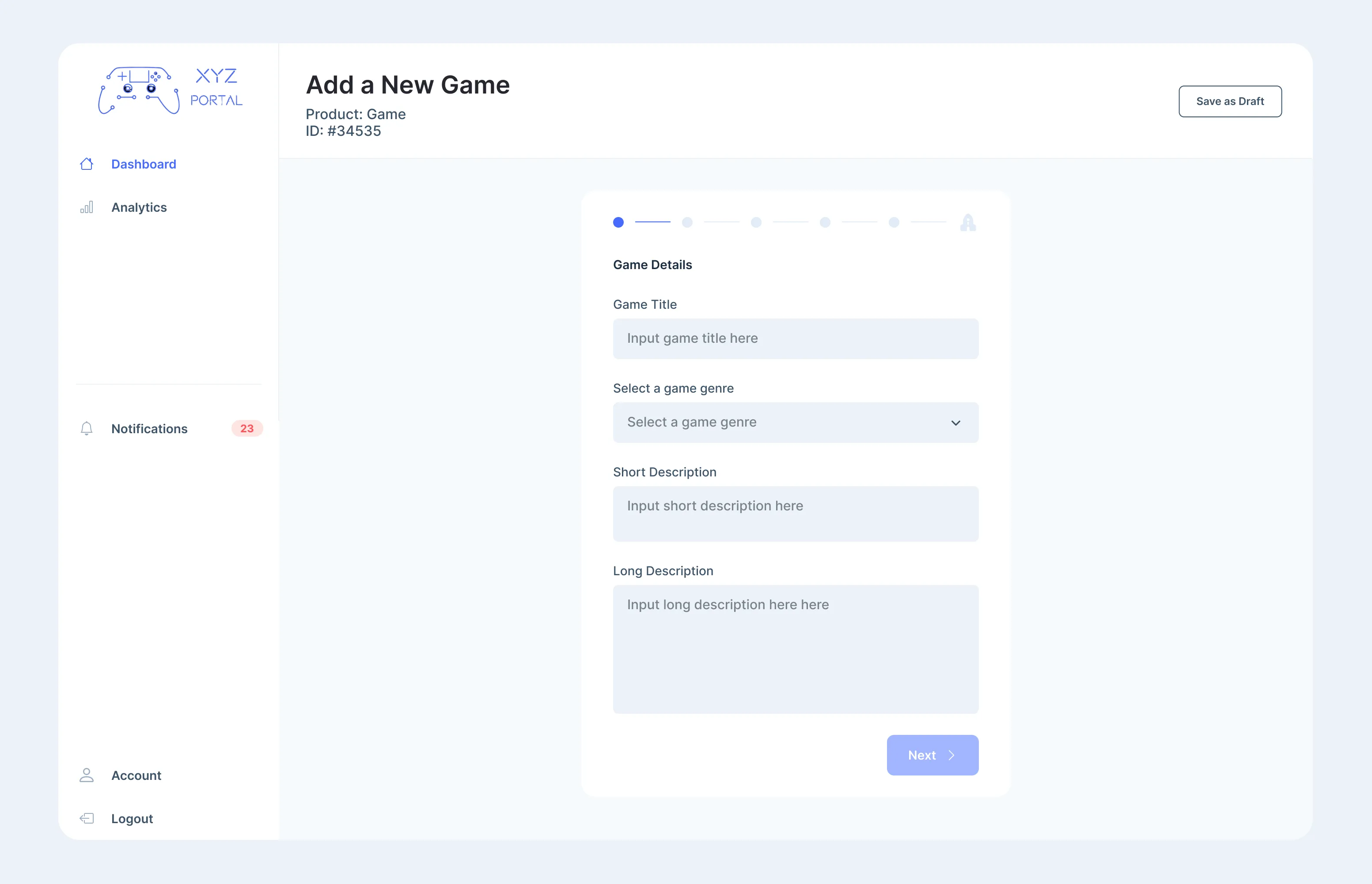
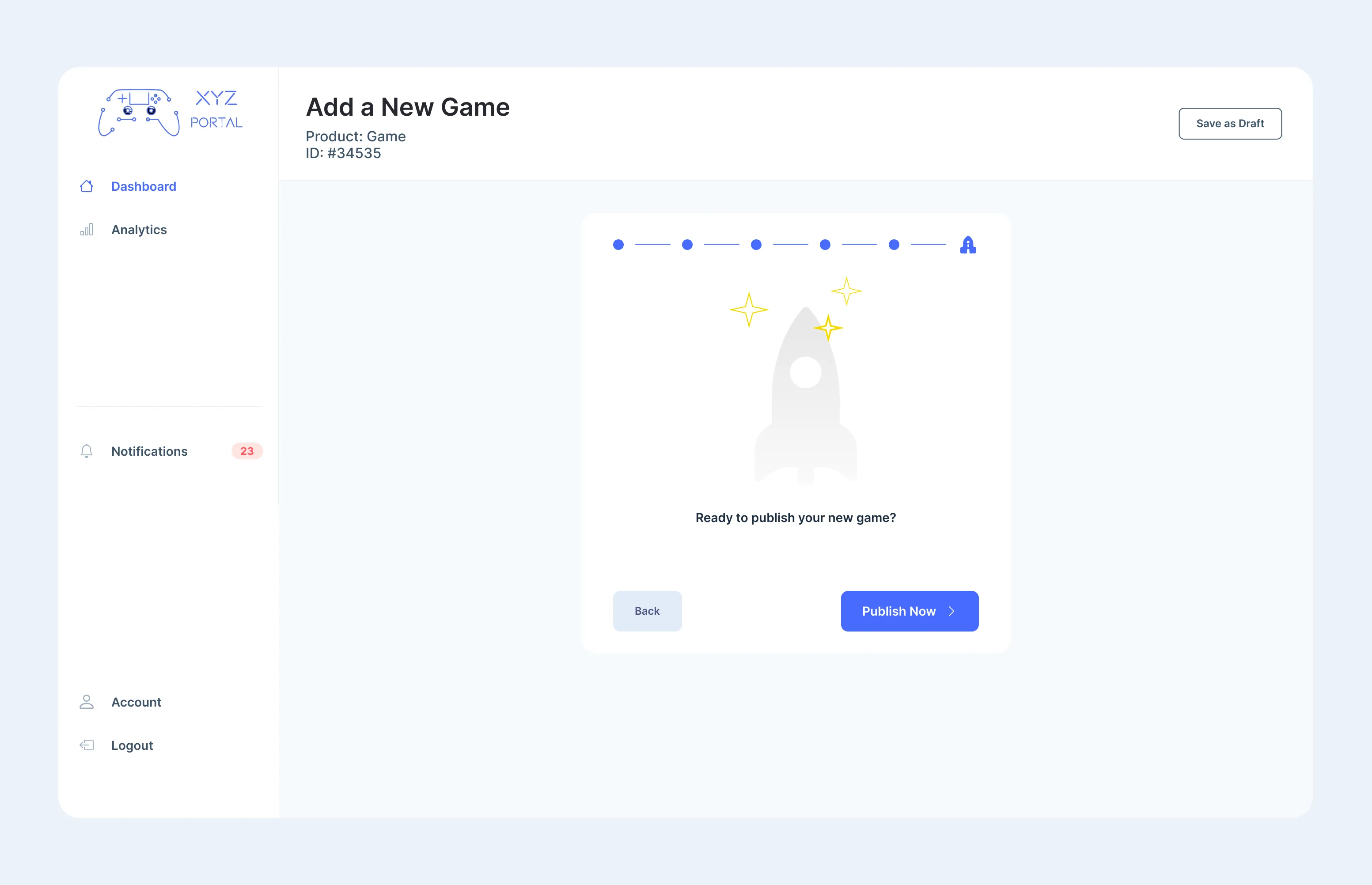
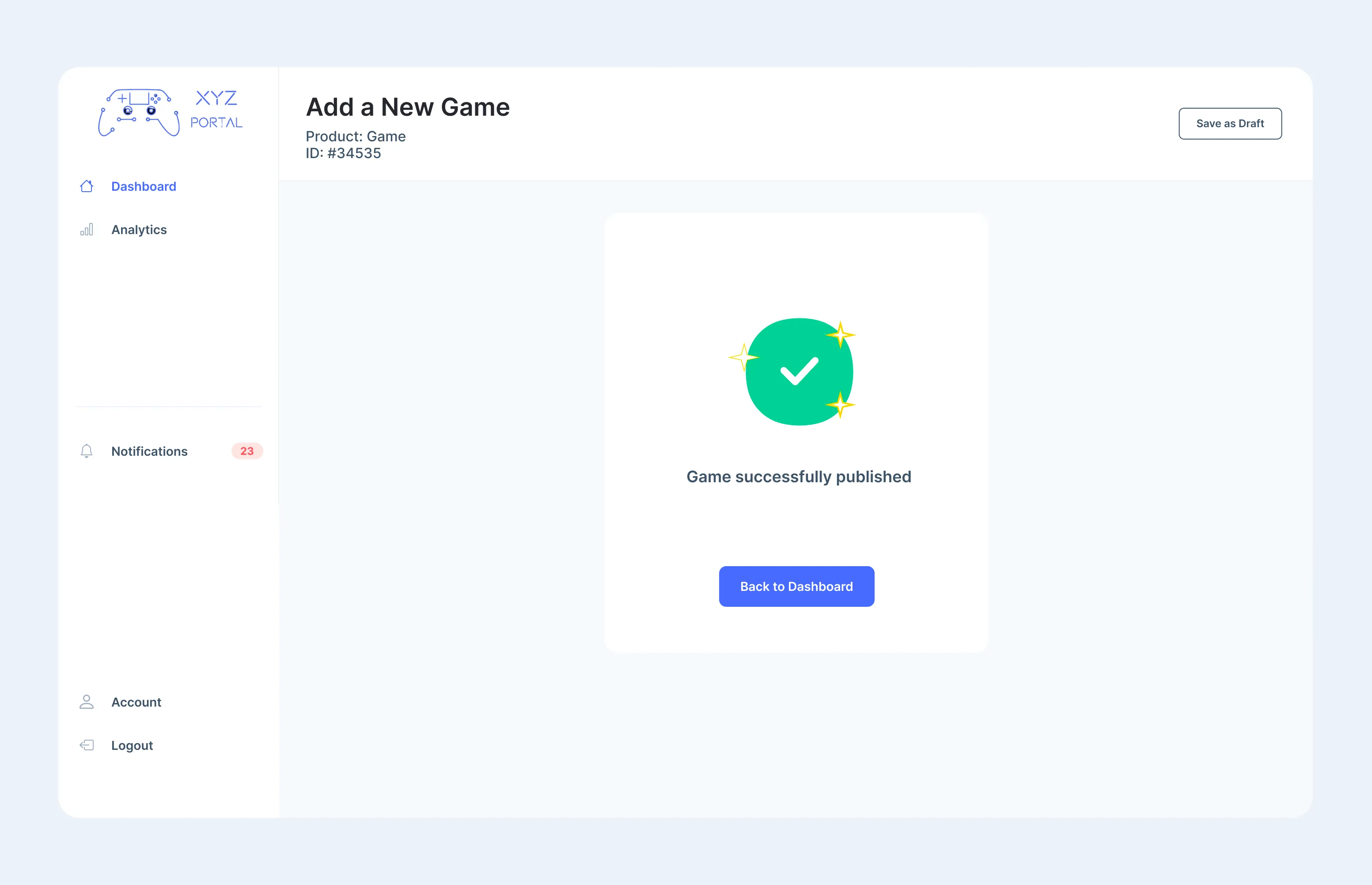
3. Process Publish a New Game
1. Fill the form
2. Ready to publish screen
3. Successfully to publish the game
4. Preview Page
Usability Testing with SUS
The System Usability Scale (SUS) is a commonly used tool in usability testing to measure the overall usability of a system or product. It is a 10-item questionnaire that asks users to rate their agreement with a series of statements on a 5-point scale, from “strongly disagree” to “strongly agree.” The SUS questionnaire is designed to be quick and easy for users to complete, and it provides a single score that reflects the overall usability of the system. The score can be used to identify areas for improvement in the design of the system and to compare the usability of different systems or products.
Usability Testing with SUS for XYZ Game Store Only
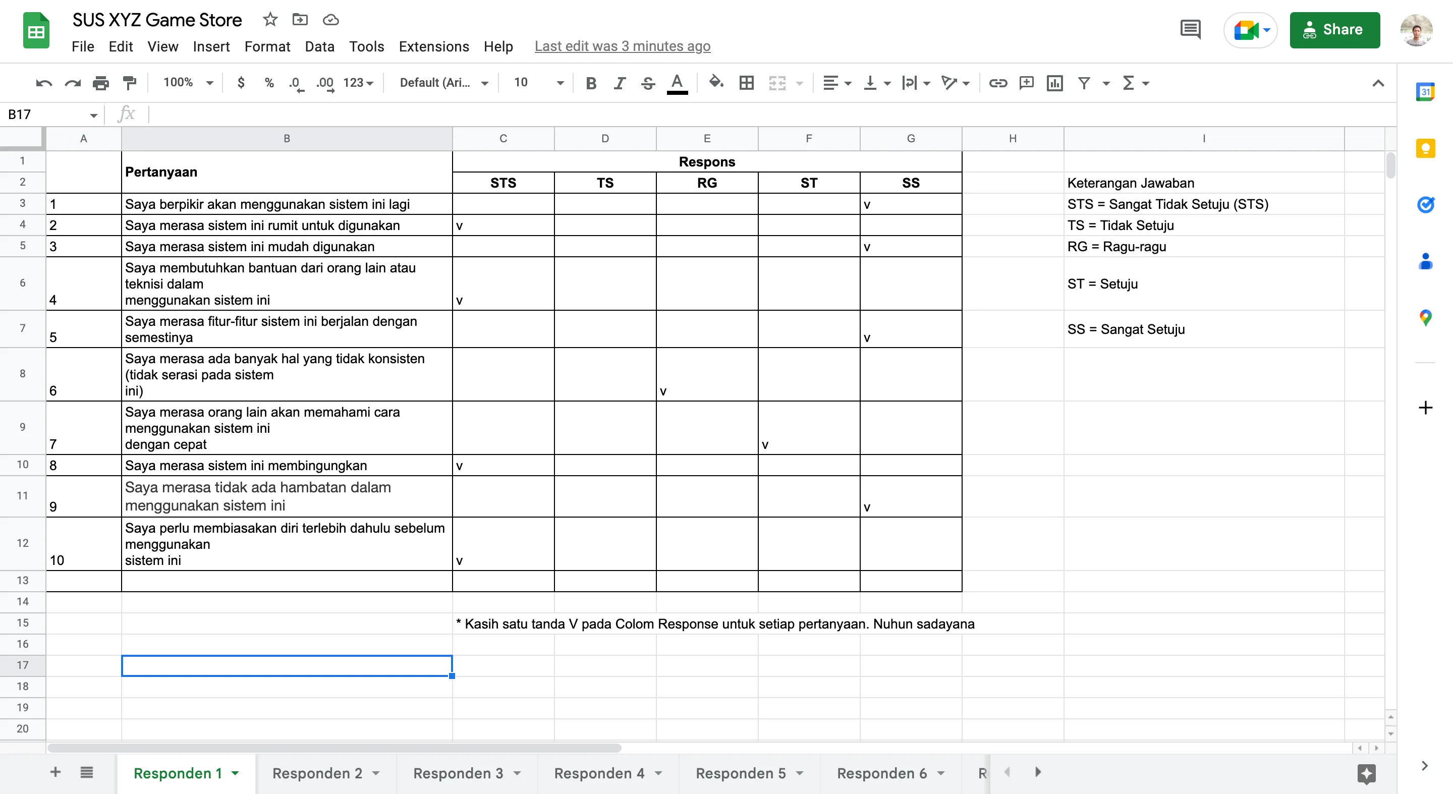
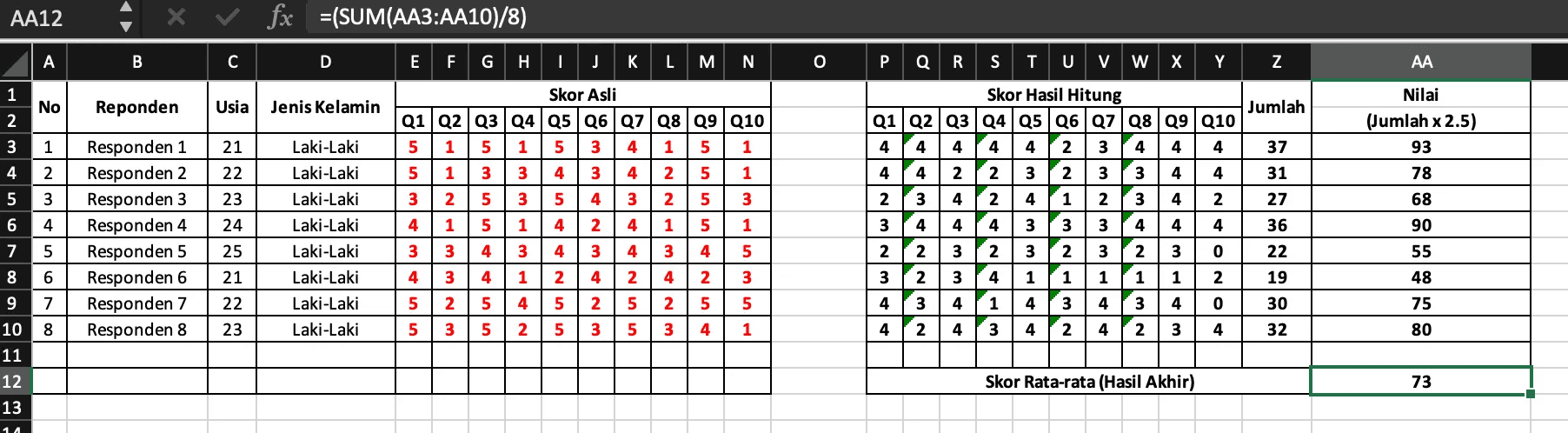
Due to time constraints and limited prospective candidates, I will only conduct the UT using the SUS method for the XYZ Game Store website only. I got 8 respondents who were kind and willing to try the design I made and filled out a questionnaire form to do the SUS calculation
The following is an example of a spreadsheet from the first respondent of 8 respondents. The complete data for the eight respondents can be seen in the links below at the end of the project.
Then do the calculation with the following formula:
For each odd numbered question, the score for each question obtained from the user’s score will be reduced by 1.
For each even numbered question, the final score is obtained from the value of 5 minus the question score obtained from the user.
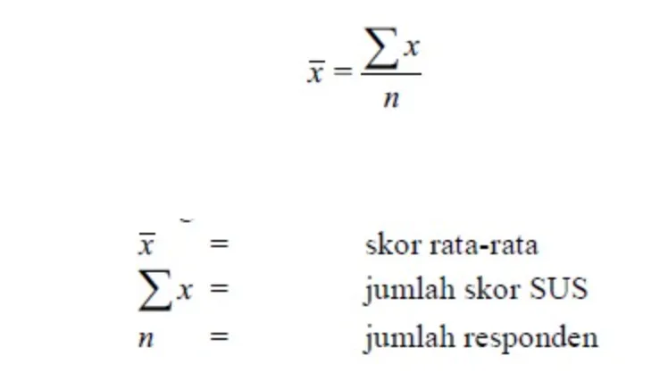
The SUS score is obtained from the sum of the scores for each question which is then multiplied by 2.5.
The score calculation rules apply to 1 respondent. For further calculations, the SUS score of each respondent is sought by the average score by adding up all scores and dividing by the number of respondents.
The following formula calculates the sus score:
From the results of these calculations, the average result is 73 as shown below:
To summarize, the System Usability Scale (SUS) is used to evaluate the usability of a system by calculating the average score of all respondents. If the score is above 68, it is considered above average, while scores below 68 are considered below average. If the score is below 68, it suggests that there may be issues with usability that need to be addressed.
The final conclusion can be determined through an assessment, using the scale shown in the figure.

This statement suggests that the product being evaluated has a good usability score, because the score obtained was 73, which falls into the “good” category according to the classification system being used.
“I have received several feedback from the last usability test with the SUS, as there are still many areas that need improvement. However, these experiences have been valuable lessons in this project. Thank you for giving me the opportunity to work on this project. I look forward to collaborating with you in the future.”
Thank you.
Link to the related work:
The prototype for the XYZ Game Store can be accessed using the link provided below:
https://www.figma.com/proto/lossKEWwvEZx04deaaYZhd/Prototype-XYZ-Publisher?page-id=0%3A1&node-id=71%3A3398&viewport=3059%2C-306%2C0.2&scaling=min-zoom&starting-point-node-id=71%3A3398The prototype for the XYZ Admin Portal can be accessed using the link provided below:
https://www.figma.com/proto/lossKEWwvEZx04deaaYZhd/Prototype-XYZ-Publisher?page-id=75%3A11401&node-id=86%3A16721&viewport=477%2C684%2C0.06&scaling=min-zoom&starting-point-node-id=86%3A16721The SUS questionnaire can be accessed using the link provided below:
https://docs.google.com/spreadsheets/d/12DQYS5pm1qSpv-trVePZ_sYc9P7V0fSuo4Eb-891iWQ/edit?usp=sharingThe SUS Average Final result can be accessed using the link provided below:
https://docs.google.com/spreadsheets/d/1qmxREZZETq4v-qXB3UTohbUuBeAvmi4b/edit?usp=sharing&ouid=109924681220374525101&rtpof=true&sd=true
Join our Community Forum
Any other questions? Get in touch