Case Studies
Improve OTP Push Notification
UI/UX Case Study to Improve OTP Push Notification Onboarding at Tokopedia
Improve OTP Push Notification Onboarding
Role: UI Designer
Responsibility: Research, Wireframing, UI Design, Motion Design Prototyping, UT
Background
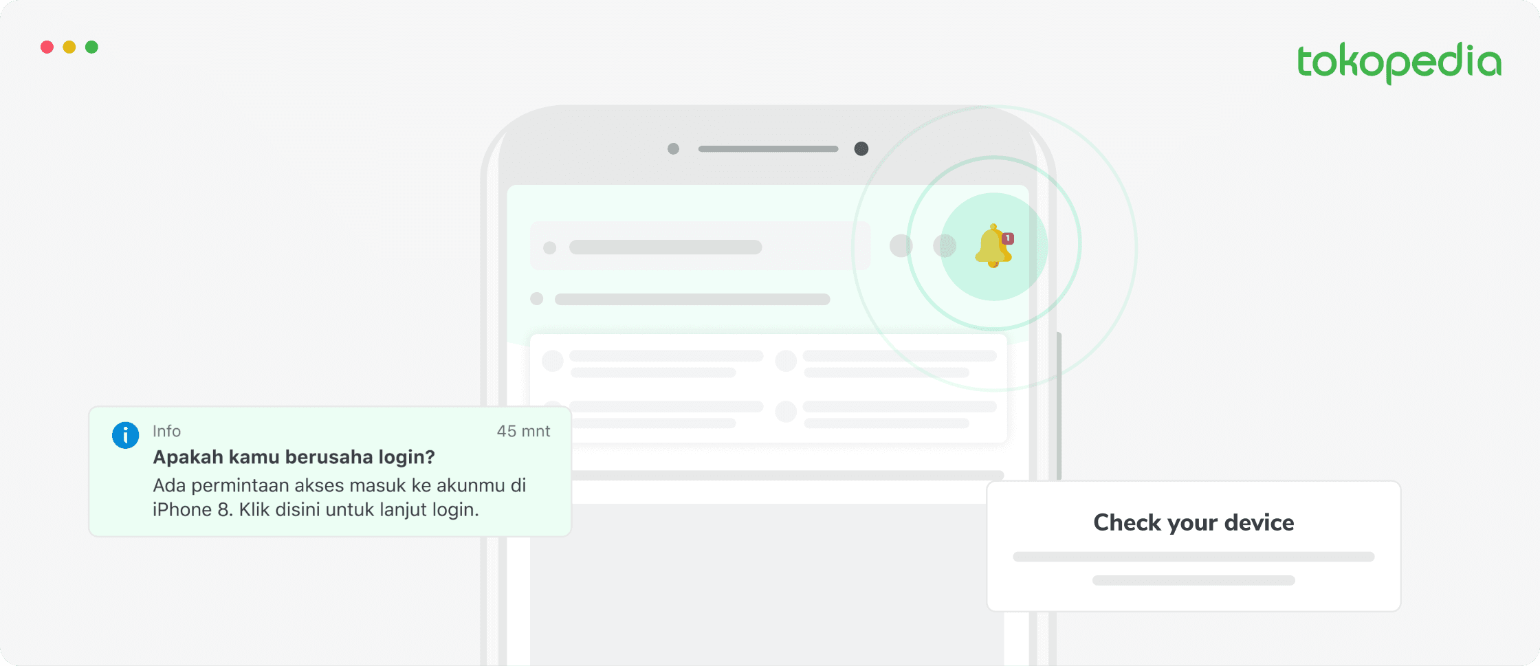
Majority of users said that they did not receive notifications on their phones. This is because they don't read the information in the ticker. They also said that the images that appear are only notifications via push-notif, so they feel no need to open the Tokopedia application.
Objective
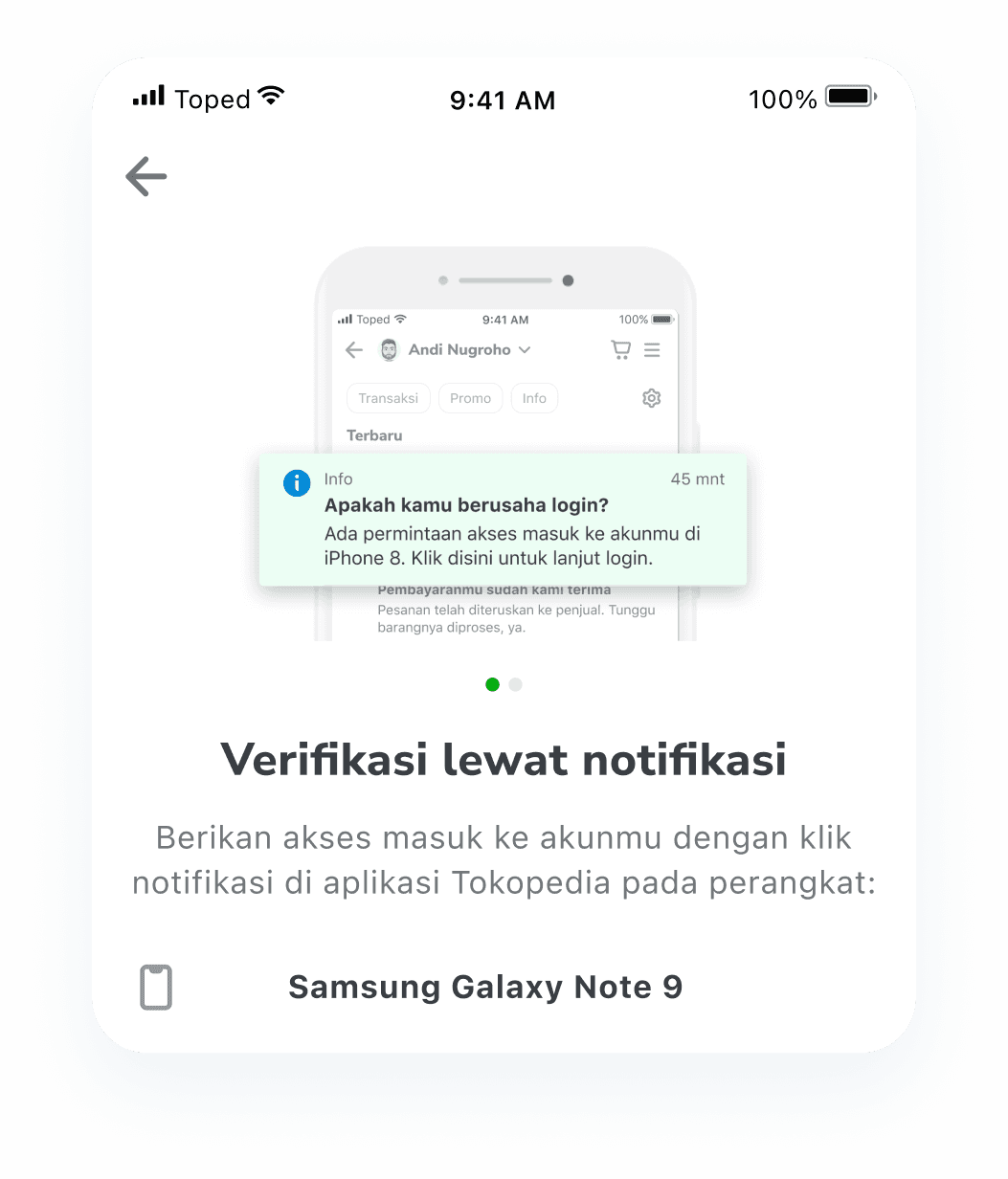
Encourage user to open their OTP notification in Tokopedia apps notification center
Work Process
1. Understanding
Context:
OTP Notification is a password code that is only temporary and can be used only once, which will be received by the user through a notification on the user's device.
Finding Issue:
User having issue with receiving the Push Notification.
Cause:
User don’t see any notification on the device.
2. Empthatizing (Research)
Guerilla Test
Scenario:
Login on a device that has not logged in to the Tokopedia application using the notification OTP login method.
Task:
You have two devices, both of which have the Tokopedia application installed. But only one device is logged in.
Result:
1. "A bit confused, it's not clear where to open the application (even though it's already listed there).
2. "Open the app or what before click send now what after click send now?"
3. "Users tend to read information the one that gets the attention first."
4. "Directly focus on the banner blue didn't read the instructions."
3. Define
"HMW help users to show and open their Tokopedia app to check notification center?"
- why need to encourage user to open their notification on tokopedia apps?
- Issue in tech limitation that otp push notification can’t show directly into user device notification center.
- Do we have trick for this?
4. Ideation
There are many ways to solve the problem at hand. One way to solve the problem in this project is to use one of the Aesthetic-Usability Effects. Aesthetic usability effects refer to the tendency of users to perceive attractive products as more useful. People tend to believe that things that look better will work better — even if they aren't actually more effective or efficient.
An aesthetically pleasing design creates a positive response in people’s brains and leads them to believe the design actually works better.
People are more tolerant of minor usability issues when the design of a product or service is aesthetically pleasing.
An aesthetically pleasing design creates a positive response in people’s brains and leads them to believe the design actually works better.
5. Visualization
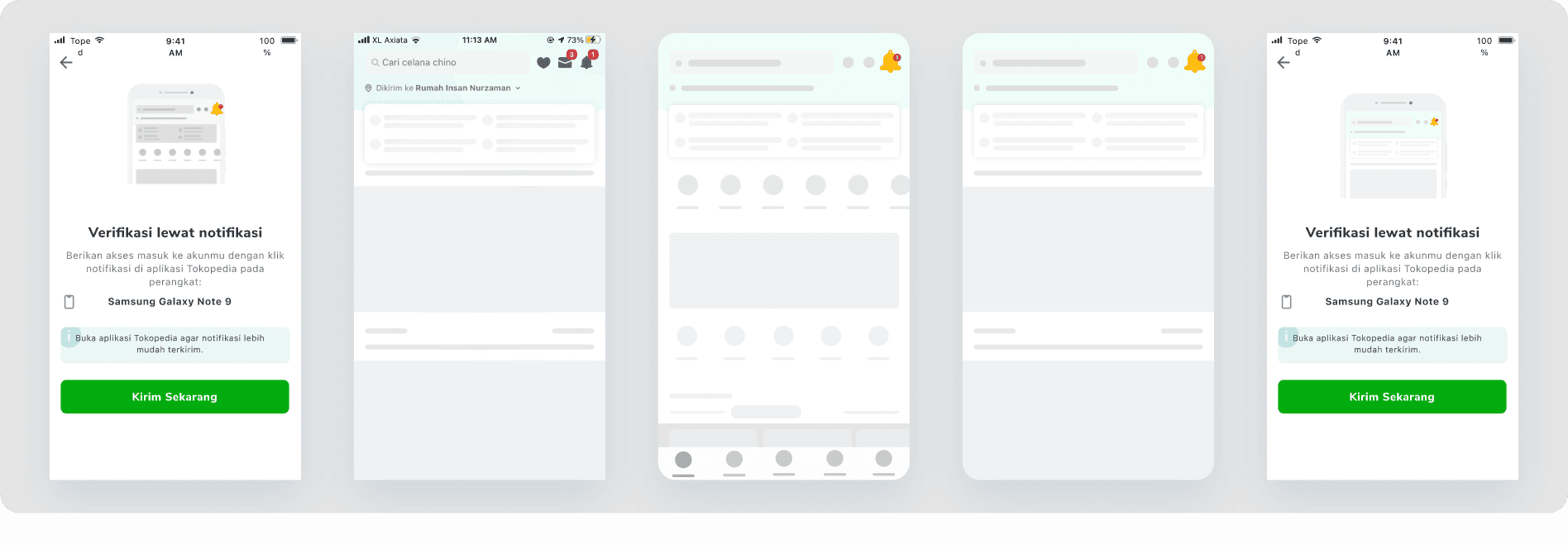
Benchmarking
One of the platforms that is used as a reference is Google, especially during the 2-step verification process. The Tokopedia feature being worked on is very similar to the verification flow from Google. Therefore we can take this flow and way of working as a preferred solution option
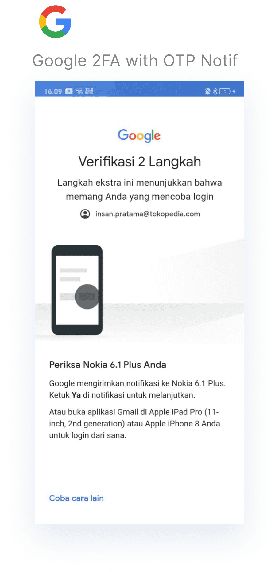
The reference shot dribbble from Jon Anto inspired me to be able to make beautiful motion notifications
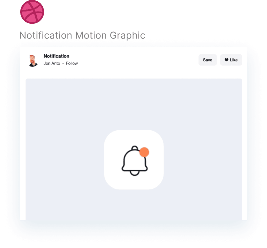
Illustration Process
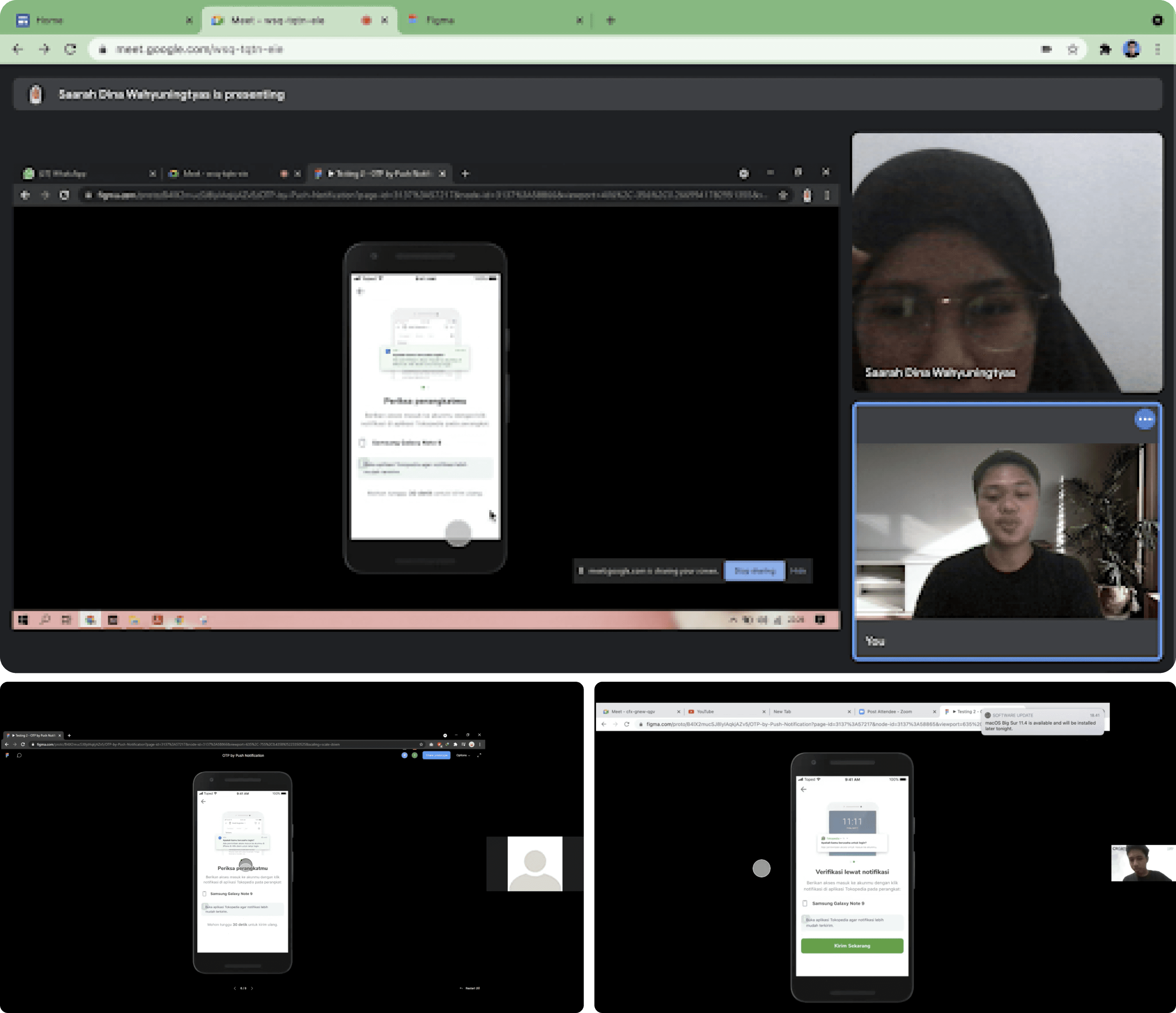
Before making an animation that can solve the problem at hand, I try to make an illustration first using figma to get the composition and components that will be highlighted in the process of making the animation later.
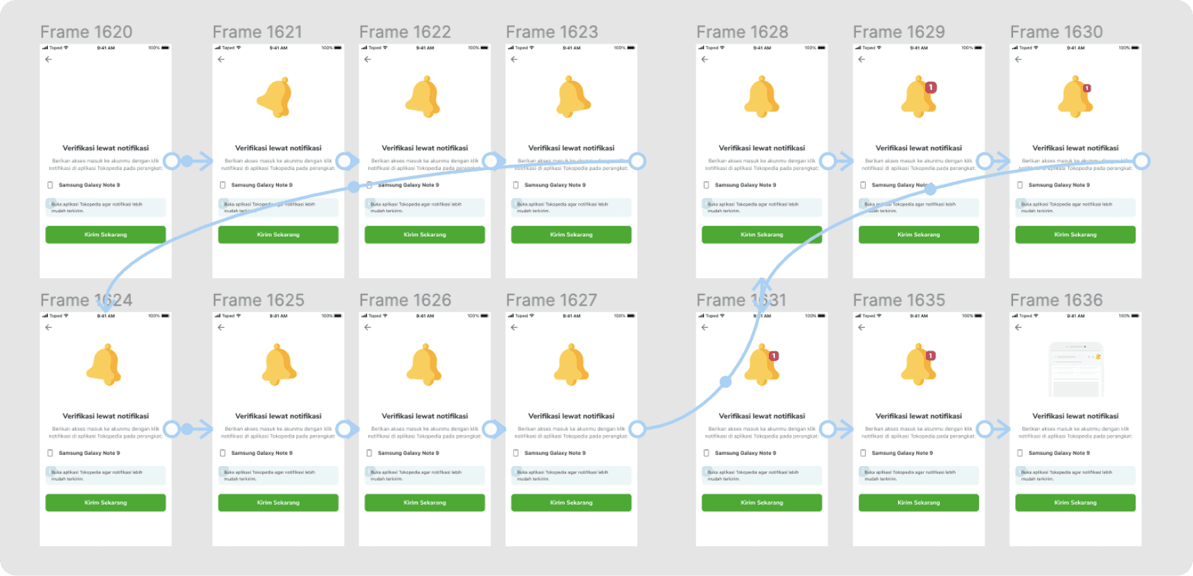
Low-fi Illustration Process
This is the process of making animation/motion graphics, namely by making the prototype first using figma, to get a smooth picture and movement as well as what scenes will appear in the animation.
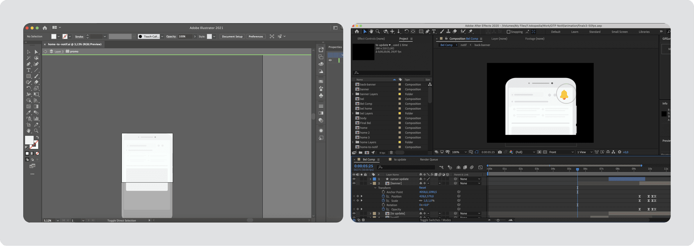
Hi-fi Animation Process
In the animation stage. I will export the illustration from figma into adobe illustration for later, unfortunately, turn it into an animation in the form of a gif using Adobe After Effects. After being exported into a gif, I applied it to the complete flow of the verification of the Tokopedia apps using notifications that can be seen on Tokopedia's live products until now.
Animation on Prototype Result

Outcomes
Success to improve the success rate about 4% which translated to remove 6000 wasted request every month or equal with Rp2.1 mio saving per month

Learnings
Fostering compassion for a user base I didn't know anything about has greatly aided my development as a designer.
Since I designed the project, my understanding of technical constraints and feasibility has significantly increased, and I have been able to set reasonable product milestones.
Rushing to the high fidelity stage could be appealing, but the majority of the work is done before that point.
Join our Community Forum
Any other questions? Get in touch